/* hero-v2.jsx — Hero v3.
   Replaces window.Hero. Three "live system" compositions for the hero:
     • orbital   (A · Operational Core)
         Glowing core + 6 satellite chips orbiting, sequential pulses.
         Beneath: a thin "Entendió → Consultó → Decidió → Avisó" execution rail.
     • pipeline  (B · Agent Plan Constellation)
         Vertical agent-plan checklist (4 phases) with status chips,
         system source chips drifting alongside.
     • portal    (C · Aurora Gateway)
         Centered hero. Beams + aurora drift down toward a portal,
         with 6 source chips floating along the beams.
   All three use a single shared <DemoPeek/> at the bottom: a clipped,
   fade-masked preview of <HeroChat/> with a CTA into #caso.
*/

const { useEffect: useEffectV2, useRef: useRefV2, useState: useStateV2, useMemo: useMemoV2 } = React;

/* ─────────────────────────────────────────────────────────────
   Atoms
   ────────────────────────────────────────────────────────────── */

function Eyebrow({ text }) {
  return (
    <div className="inline-flex items-center gap-2.5 rounded-full pl-3 pr-4 py-1.5
                    border border-line bg-glass backdrop-blur-md
                    text-[10.5px] font-mono uppercase tracking-[0.22em] text-ink/80">
      <span className="relative flex size-1.5">
        <span className="absolute inset-0 rounded-full bg-cyan animate-ping opacity-60" />
        <span className="relative rounded-full bg-cyan size-1.5" />
      </span>
      {text}
    </div>
  );
}

function HeadlineV2({ text, size = 'lg' }) {
  const sizes = {
    xl: 'text-[clamp(46px,6.2vw,96px)] leading-[0.96]',
    lg: 'text-[clamp(38px,4.8vw,70px)] leading-[1.00]',
    md: 'text-[clamp(34px,4.2vw,60px)] leading-[1.02]'
  };
  const renderLine = (line, li) => {
    const parts = line.split(/(\*[^*]+\*)/g).filter(Boolean);
    return (
      <span key={li} className="block">
        {parts.map((p, i) => {
          if (p.startsWith('*') && p.endsWith('*')) {
            return (
              <span key={i} className="italic text-cyan"
                style={{ textShadow: '0 0 28px rgba(51,194,234,0.45)' }}>
                {p.slice(1, -1)}
              </span>
            );
          }
          return <span key={i}>{p}</span>;
        })}
      </span>
    );
  };
  return (
    <h1 className={`font-serif ${sizes[size]} tracking-[-0.012em] text-ink/97`}
      style={{ fontFamily: '"Instrument Serif", serif' }}>
      {text.split('\n').map(renderLine)}
    </h1>
  );
}

function Subheadline({ text, className = '' }) {
  return (
    <p className={`text-[15.5px] md:text-[17px] leading-[1.55] text-ink/72 max-w-[560px] ${className}`}>
      {text}
    </p>
  );
}

function HeroCTAs({ align = 'left' }) {
  const justify = align === 'center' ? 'justify-center' : 'justify-start';
  return (
    <div className={`flex flex-wrap items-center gap-3 ${justify}`}>
      {/* V3 polish (2026-05-19) — antes este CTA bajaba a #agente y duplicaba
          el cue inferior (TintineoCue) que ya invita al demo. Ahora apunta a
          #contacto con la copy estándar "Reservar diagnóstico", consistente
          con el resto del sitio (nav, hero mobile legacy, footer). */}
      <a href="#contacto"
        className="btn-cta rounded-full bg-ink text-bg px-6 py-3.5 text-[13.5px] font-medium
                   inline-flex items-center gap-3">
        Reservar diagnóstico
        <span aria-hidden="true" className="btn-arrow">→</span>
      </a>
      {/* V3 polish ADDENDUM 9: este CTA antes duplicaba el cue inferior (ambos
          bajaban a #agente). Ahora invita a explorar la propuesta de valor en
          la sección `Cuando la IA entiende tu lógica...` (id=inteligencia-operativa).
          El cue inferior (TintineoCue) sigue siendo el path natural al demo V7. */}
      <a href="#inteligencia-operativa"
        className="btn-cta rounded-full border border-line bg-bg/40 px-6 py-3.5 text-[13.5px]
                   text-ink/90 inline-flex items-center gap-3">
        <span aria-hidden="true" className="size-1.5 rounded-full bg-cyan pulse-node" />
        ¿Qué podemos hacer por vos?
        <span aria-hidden="true" className="text-cyan btn-arrow">→</span>
      </a>
    </div>
  );
}

function ScrollCue({ text = 'Ver un agente trabajando en vivo', align = 'left' }) {
  // Kept as compat wrapper — now renders the richer TintineoCue.
  return <TintineoCue text={text} />;
}

/* ─────────────────────────────────────────────────────────────
   TintineoCue — premium "call to scroll" button (rediseñado).
   v2 (2026-05-18) — Reemplaza la versión typewriter+sparkles por un
   diseño botón premium: pill grande con borde cónico animado (gradient
   rotante cyan/violet), halo radial breathing detrás, LED pulsante,
   texto con shimmer suave, chevron en cápsula que rebota. Sin máquina
   de escribir — el texto queda permanentemente legible, y en mobile
   <640 px envuelve a 2 líneas sin overflow ni corte.
   Mantiene texto y destino #agente. Hover/focus con glow + lift.
   ────────────────────────────────────────────────────────────── */
function TintineoCue({ text = 'Ver un agente trabajando en vivo', href = '#agente' }) {
  const onClick = (e) => {
    const target = document.querySelector(href);
    if (!target) return;
    e.preventDefault();
    const top = target.getBoundingClientRect().top + window.scrollY - 40;
    window.scrollTo({ top, behavior: 'smooth' });
  };
  return (
    <a href={href} onClick={onClick}
       aria-label="Ver un agente trabajando en vivo"
       className="tn-cue group relative inline-flex items-center justify-center
                  rounded-full select-none isolate"
       style={{
         width: 'min(660px, calc(100vw - 32px))',
         padding: '14px 22px',
         gap: 14,
         border: '1px solid rgba(91,213,242,0.55)',
         background: 'linear-gradient(135deg, rgba(11,15,24,0.92) 0%, rgba(15,22,34,0.92) 100%)',
         backdropFilter: 'blur(20px) saturate(140%)',
         WebkitBackdropFilter: 'blur(20px) saturate(140%)',
         boxShadow: 'inset 0 1px 0 rgba(244,241,234,0.10), 0 22px 60px -28px rgba(91,213,242,0.55), 0 0 36px rgba(51,194,234,0.20)',
         color: '#F4F1EA',
         textDecoration: 'none'
       }}>
      {/* Halo radial detrás — breathing */}
      <span aria-hidden="true" className="tn-halo" />

      {/* Borde cónico animado (gradient rotating) */}
      <span aria-hidden="true" className="tn-ring" />

      {/* LED dot pulsante */}
      <span className="relative inline-flex shrink-0 size-2">
        <span className="absolute inset-0 rounded-full bg-cyan animate-ping opacity-70" />
        <span className="relative rounded-full bg-cyan size-2"
              style={{ boxShadow: '0 0 10px rgba(51,194,234,0.95), 0 0 22px rgba(51,194,234,0.45)' }} />
      </span>

      {/* Texto */}
      <span className="tn-text relative font-mono uppercase">
        {text}
      </span>

      {/* Chevron en cápsula que rebota */}
      <span aria-hidden="true" className="tn-chev relative inline-flex shrink-0 items-center justify-center"
            style={{
              width: 28, height: 28,
              borderRadius: 999,
              border: '1px solid rgba(91,213,242,0.55)',
              background: 'rgba(51,194,234,0.12)',
              color: '#5BD5F2',
              fontSize: 14,
              lineHeight: 1
            }}>
        ↓
      </span>

      <style>{`
        .tn-cue {
          transition: transform 280ms cubic-bezier(0.4,0,0.2,1),
                      box-shadow 280ms ease,
                      border-color 280ms ease;
        }
        .tn-cue::before {
          content: '';
          position: absolute;
          inset: 0;
          border-radius: inherit;
          background: linear-gradient(90deg,
            transparent 0%,
            rgba(244,241,234,0.06) 50%,
            transparent 100%);
          opacity: 0;
          transition: opacity 320ms ease;
          pointer-events: none;
        }
        .tn-cue:hover {
          transform: translateY(-3px);
          border-color: rgba(91,213,242,0.95) !important;
          box-shadow:
            inset 0 1px 0 rgba(244,241,234,0.16),
            0 30px 80px -28px rgba(91,213,242,0.75),
            0 0 48px rgba(51,194,234,0.42) !important;
        }
        .tn-cue:hover::before { opacity: 1; }
        .tn-cue:hover .tn-chev {
          background: rgba(51,194,234,0.22) !important;
          border-color: rgba(91,213,242,0.95) !important;
          transform: translateY(2px) scale(1.06);
        }
        .tn-cue:active { transform: translateY(-1px) scale(0.992); }
        .tn-cue:focus-visible {
          outline: 2px solid rgba(91,213,242,0.95);
          outline-offset: 4px;
        }

        /* Borde cónico animado — rotación lenta tipo "luz alrededor" */
        .tn-ring {
          position: absolute;
          inset: -1px;
          border-radius: 9999px;
          padding: 1px;
          background: conic-gradient(from var(--tn-a, 0deg),
            rgba(91,213,242,0.00) 0deg,
            rgba(91,213,242,0.85) 90deg,
            rgba(158,123,255,0.55) 150deg,
            rgba(91,213,242,0.95) 220deg,
            rgba(91,213,242,0.00) 360deg);
          -webkit-mask:
            linear-gradient(#000 0 0) content-box,
            linear-gradient(#000 0 0);
          mask:
            linear-gradient(#000 0 0) content-box,
            linear-gradient(#000 0 0);
          -webkit-mask-composite: xor;
          mask-composite: exclude;
          animation: tn-rotate 6s linear infinite;
          opacity: 0.85;
          pointer-events: none;
        }
        @property --tn-a { syntax: '<angle>'; inherits: false; initial-value: 0deg; }
        @keyframes tn-rotate { to { --tn-a: 360deg; } }

        /* Halo radial breathing.
           V3 polish ADDENDUM 33 retry (2026-05-19) — inset reducido de
           -18px a -4px y scale() removido del breathing. El halo extendia
           430px de ancho (inset + scale 1.04) sobre un botón de 380px en
           viewport 412, generando ~9 px de overflow horizontal de body
           pese a body/html overflow-x: clip. Ahora se mantiene el shimmer
           via opacity, sin push horizontal. */
        .tn-halo {
          position: absolute;
          inset: -4px;
          border-radius: 9999px;
          background: radial-gradient(ellipse at center,
            rgba(91,213,242,0.22) 0%,
            rgba(91,213,242,0.06) 45%,
            transparent 72%);
          filter: blur(18px);
          opacity: 0.55;
          z-index: -1;
          animation: tn-halo-breath 3.8s ease-in-out infinite;
          pointer-events: none;
        }
        @keyframes tn-halo-breath {
          0%, 100% { opacity: 0.42; }
          50%      { opacity: 0.78; }
        }

        /* Texto con shimmer suave + tracking adaptativo */
        .tn-text {
          font-size: 12.5px;
          letter-spacing: 0.22em;
          background: linear-gradient(90deg,
            #FFFFFF 0%,
            #FFFFFF 35%,
            #B0EDFA 50%,
            #FFFFFF 65%,
            #FFFFFF 100%);
          background-size: 220% 100%;
          background-position: 100% 50%;
          -webkit-background-clip: text;
          background-clip: text;
          color: #FFFFFF;
          -webkit-text-fill-color: transparent;
          text-shadow: 0 0 16px rgba(244,241,234,0.22);
          animation: tn-shimmer 4.2s ease-in-out infinite;
        }
        @keyframes tn-shimmer {
          0%, 100% { background-position: 100% 50%; }
          50%      { background-position: 0% 50%; }
        }

        /* Chevron — rebote constante */
        .tn-chev {
          animation: tn-bob 1.8s cubic-bezier(0.45,0,0.55,1) infinite;
          filter: drop-shadow(0 0 8px rgba(51,194,234,0.55));
          transition: transform 220ms ease, background 220ms ease, border-color 220ms ease;
        }
        @keyframes tn-bob {
          0%, 100% { transform: translateY(0); }
          50%      { transform: translateY(3px); }
        }

        /* Mobile <640: 2 líneas, font más chico, tracking compacto, sin overflow.
           V3 polish (2026-05-19) — Texto en mobile: descartar el shimmer via
           background-clip:text y usar color sólido blanco. En Android real
           (especialmente Samsung OLED) Chrome puede no aplicar correctamente
           -webkit-background-clip:text combinado con -webkit-text-fill-color:
           transparent, dejando el texto invisible/apagado sobre el fondo
           oscuro del botón. Forzando color sólido + text-shadow cyan se
           mantiene el efecto premium sin riesgo de invisibilidad. */
        @media (max-width: 640px){
          .tn-cue {
            padding: 12px 18px !important;
            gap: 10px !important;
            border-radius: 22px !important;
          }
          .tn-text {
            font-size: 10.5px !important;
            letter-spacing: 0.14em !important;
            text-align: center;
            line-height: 1.32;
            white-space: normal;
            flex: 1 1 auto;
            min-width: 0;
            /* Texto blanco sólido legible en cualquier mobile, con shimmer
               cyan suave via text-shadow en vez de background-clip. */
            background: none !important;
            -webkit-background-clip: initial !important;
            background-clip: initial !important;
            color: #FFFFFF !important;
            -webkit-text-fill-color: #FFFFFF !important;
            animation: none !important;
            text-shadow:
              0 0 14px rgba(91,213,242,0.55),
              0 0 4px rgba(244,241,234,0.35),
              0 1px 0 rgba(0,0,0,0.18);
          }
        }
        @media (max-width: 380px){
          .tn-text {
            font-size: 9.5px !important;
            letter-spacing: 0.10em !important;
          }
        }

        /* Reduced motion */
        @media (prefers-reduced-motion: reduce){
          .tn-text, .tn-chev, .tn-ring, .tn-halo { animation: none !important; }
          .tn-text {
            color: rgba(244,241,234,0.92);
            background: none;
            -webkit-text-fill-color: rgba(244,241,234,0.92);
          }
          .tn-ring { opacity: 0.5; }
          .tn-halo { opacity: 0.4; }
        }
      `}</style>
    </a>
  );
}

/* ─────────────────────────────────────────────────────────────
   System steps + icons
   ────────────────────────────────────────────────────────────── */
const SYSTEM_STEPS = [
  { id: 'msg',          label: 'Mensaje',      icon: 'msg',          sub: 'WhatsApp' },
  { id: 'rule',         label: 'Reglas',       icon: 'rule',         sub: 'tu lógica' },
  { id: 'crm',          label: 'CRM',          icon: 'db',           sub: 'datos vivos' },
  { id: 'decision',     label: 'Decisión',     icon: 'decision',     sub: 'agente' },
  { id: 'followup',     label: 'Seguimiento',  icon: 'clock',        sub: 'agenda' },
  { id: 'team',         label: 'Equipo',       icon: 'team',         sub: 'aviso humano' },
];

/* V3 · benefits renovados (2026-05-18, dirección Codex/Martin).
   Reemplaza los porcentajes genéricos del template fuente
   (+200%/−92%/24/7/...) por verb-led capabilities defendibles que el
   brief explícitamente pide: detectar intención, consultar reglas/datos,
   recuperar conversaciones pendientes, avisar al equipo con resumen útil,
   ceder ante humano, leer multi-input (PDF/audio/imagen), aprender de QA.
   Iconos usan glyphs ya definidos en SysIcon más arriba (target, rule,
   db, clock, msg, team) + 2 reusados (check, rocket) — sin glyphs nuevos. */
const BENEFITS = [
  { id: 'intent',   icon: 'target', value: 'Detecta',  label: 'Intención real',      sub: 'qué quiere el cliente' },
  { id: 'rules',    icon: 'rule',   value: 'Sigue',    label: 'Tus reglas',          sub: 'responde como tu equipo' },
  { id: 'crm',      icon: 'db',     value: 'Consulta', label: 'CRM en vivo',         sub: 'datos antes de hablar' },
  { id: 'followup', icon: 'clock',  value: 'Retoma',   label: '"Te aviso"',          sub: 'con cron y contexto' },
  { id: 'notify',   icon: 'msg',    value: 'Avisa',    label: 'Al equipo',           sub: 'resumen accionable' },
  { id: 'handoff',  icon: 'team',   value: 'Cede',     label: 'A la persona',        sub: 'handoff transparente' },
  { id: 'multi',    icon: 'check',  value: 'Lee',      label: 'PDF · audio · foto',  sub: 'DNI · comprobantes · voz' },
  { id: 'learn',    icon: 'rocket', value: 'Aprende',  label: 'De cada caso',        sub: 'QA semanal · mejora medible' },
];

const PLAN_PHASES = [
  { id: 'understood', label: 'Entendió', sub: 'consulta de Diego',           tags: ['Mensaje'],            status: 'done' },
  { id: 'queried',    label: 'Consultó', sub: 'reglas + datos del CRM',      tags: ['Reglas','CRM'],       status: 'done' },
  { id: 'decided',    label: 'Decidió',  sub: 'derivar a Matías',            tags: ['Decisión'],           status: 'live' },
  { id: 'notified',   label: 'Avisó',    sub: 'email + seguimiento +24h',    tags: ['Seguimiento','Equipo'], status: 'pending' },
];

function SysIcon({ name, size = 16 }) {
  const c = { width: size, height: size, viewBox: '0 0 24 24', fill: 'none',
              stroke: 'currentColor', strokeWidth: 1.4, strokeLinecap: 'round', strokeLinejoin: 'round' };
  switch (name) {
    case 'msg':
      return (<svg {...c}><path d="M4 6.5C4 5.7 4.7 5 5.5 5h13c.8 0 1.5.7 1.5 1.5v8c0 .8-.7 1.5-1.5 1.5H10l-4 3v-3H5.5C4.7 16 4 15.3 4 14.5v-8Z" /><circle cx="9"  cy="10.5" r=".7" fill="currentColor" stroke="none" /><circle cx="12" cy="10.5" r=".7" fill="currentColor" stroke="none" /><circle cx="15" cy="10.5" r=".7" fill="currentColor" stroke="none" /></svg>);
    case 'rule':
      return (<svg {...c}><path d="M12 3v18M3 8h6M3 12h6M3 16h6M15 8h6M15 12h6M15 16h6" /><circle cx="12" cy="12" r="1.3" fill="currentColor" stroke="none" /></svg>);
    case 'db':
      return (<svg {...c}><ellipse cx="12" cy="5.5" rx="7" ry="2.5" /><path d="M5 5.5v6c0 1.4 3.1 2.5 7 2.5s7-1.1 7-2.5v-6" /><path d="M5 11.5v6c0 1.4 3.1 2.5 7 2.5s7-1.1 7-2.5v-6" /></svg>);
    case 'decision':
      return (<svg {...c}><circle cx="6"  cy="6"  r="2" /><circle cx="6"  cy="18" r="2" /><circle cx="18" cy="12" r="2" /><path d="M8 6h2a4 4 0 0 1 4 4v.5M8 18h2a4 4 0 0 0 4-4V13.5" /></svg>);
    case 'team':
      return (<svg {...c}><circle cx="8"  cy="9" r="3" /><path d="M2.5 19c0-3 2.5-5 5.5-5s5.5 2 5.5 5" /><circle cx="17" cy="10" r="2.5" /><path d="M14.5 19c0-2.4 1.8-4.2 4-4.2s4 1.7 4 4.2" /></svg>);
    case 'clock':
      return (<svg {...c}><circle cx="12" cy="12" r="9" /><path d="M12 7v5l3.5 2.5" /></svg>);
    case 'rocket':
      return (<svg {...c}><path d="M12 3c4 3 6 7 6 11l-2 2c-1-3-3-5-6-6L8 12c0-4 1-7 4-9Z" /><path d="M5 19c1-2 3-3 5-3M19 19c-2-1-4-3-5-5" /><circle cx="13" cy="9" r="1.5" /></svg>);
    case 'target':
      return (<svg {...c}><circle cx="12" cy="12" r="9" /><circle cx="12" cy="12" r="5.5" /><circle cx="12" cy="12" r="1.6" fill="currentColor" stroke="none" /></svg>);
    case 'moon':
      return (<svg {...c}><path d="M20 14.5a8 8 0 1 1-10.5-10.5 7 7 0 0 0 10.5 10.5Z" /><circle cx="18" cy="6"  r=".7" fill="currentColor" stroke="none" /><circle cx="20" cy="9.5" r=".5" fill="currentColor" stroke="none" /></svg>);
    case 'coin':
      return (<svg {...c}><circle cx="12" cy="12" r="9" /><path d="M9 9.5c.5-1 2-1.5 3-1.5 1.5 0 3 1 3 2.5 0 1.5-1.5 2-3 2.5-1.5.5-3 1-3 2.5 0 1.5 1.5 2.5 3 2.5 1 0 2.5-.5 3-1.5M12 6.5v11" /></svg>);
    case 'check':
      return (<svg {...c}><circle cx="12" cy="12" r="9" /><path d="M7.5 12.5l3 3 6-7" /></svg>);
    default: return null;
  }
}

/* Glass chip — used in all three variants. */
function NodeChip({ step, active, size = 'md', glow = true }) {
  const sz = size === 'sm'
    ? { pad: 'pl-2 pr-2.5 py-1.5', icon: 13, label: 'text-[10px]', sub: 'text-[8.5px]' }
    : size === 'lg'
    ? { pad: 'pl-3 pr-3.5 py-2.5', icon: 18, label: 'text-[12px]', sub: 'text-[10px]'  }
    : { pad: 'pl-2.5 pr-3 py-2',   icon: 15, label: 'text-[11px]', sub: 'text-[9.5px]' };
  return (
    <div className={`relative inline-flex items-center gap-2 rounded-xl ${sz.pad}
                     border backdrop-blur-md transition-all duration-500
                     ${active && glow
                       ? 'border-cyan/55 bg-cyan/8 shadow-[0_0_24px_rgba(51,194,234,0.35),inset_0_0_18px_rgba(51,194,234,0.08)]'
                       : 'border-line bg-glass'}`}>
      <span className={`${active && glow ? 'text-cyan' : 'text-ink/75'} transition-colors duration-500`}>
        <SysIcon name={step.icon} size={sz.icon} />
      </span>
      <span className="leading-tight">
        <span className={`block font-mono uppercase tracking-[0.18em] ${sz.label}
                          ${active && glow ? 'text-ink' : 'text-ink/85'} transition-colors duration-500`}>
          {step.label}
        </span>
        <span className={`block font-mono ${sz.sub} text-ink/45`}>{step.sub}</span>
      </span>
    </div>
  );
}

function useStepLoop(count, intervalMs = 1300) {
  const [active, setActive] = useStateV2(0);
  useEffectV2(() => {
    if (window.matchMedia('(prefers-reduced-motion: reduce)').matches) return;
    const id = setInterval(() => setActive(a => (a + 1) % count), intervalMs);
    return () => clearInterval(id);
  }, [count, intervalMs]);
  return active;
}

/* ─────────────────────────────────────────────────────────────
   Execution rail — "Entendió → Consultó → Decidió → Avisó"
   A thin status strip used by the Operational Core variant.
   ────────────────────────────────────────────────────────────── */
function ExecutionRail() {
  const phases = ['Entendió', 'Consultó', 'Decidió', 'Avisó'];
  const active = useStepLoop(phases.length, 1300);
  return (
    <div className="inline-flex items-center gap-1.5 rounded-full border border-line bg-glass backdrop-blur-md pl-3 pr-3 py-1.5">
      <span className="font-mono text-[9.5px] uppercase tracking-[0.22em] text-ink/55 pr-1">Plan en curso</span>
      {phases.map((p, i) => {
        const isDone = i < active;
        const isLive = i === active;
        return (
          <React.Fragment key={p}>
            {i > 0 && <span aria-hidden="true" className="text-ink/30 text-[10px]">·</span>}
            <span className={`inline-flex items-center gap-1 font-mono text-[10px] uppercase tracking-[0.16em]
                              transition-colors duration-300
                              ${isLive ? 'text-cyan' : isDone ? 'text-ink/75' : 'text-ink/35'}`}>
              <span className={`inline-block size-1.5 rounded-full ${
                isLive ? 'bg-cyan animate-pulse' : isDone ? 'bg-ink/60' : 'border border-ink/30 bg-transparent'
              }`} style={isLive ? { boxShadow: '0 0 10px rgba(51,194,234,0.85)' } : {}} />
              {p}
            </span>
          </React.Fragment>
        );
      })}
    </div>
  );
}

/* ─────────────────────────────────────────────────────────────
   Demo peek — clipped, fade-masked preview of <HeroChat/>.
   Top of the chat shows under a horizon label; bottom fades to bg;
   CTA links to the full demo at #caso.
   ────────────────────────────────────────────────────────────── */
function DemoPeek({ height = 340 }) {
  const HeroChat = window.HeroChat;
  return (
    <div className="relative">
      {/* Horizon label */}
      <div className="flex items-center gap-3 mb-4">
        <span className="relative flex size-1.5">
          <span className="absolute inset-0 rounded-full bg-cyan animate-ping opacity-70" />
          <span className="relative rounded-full bg-cyan size-1.5" />
        </span>
        <span className="font-mono text-[10.5px] uppercase tracking-[0.28em] text-ink/75">
          Agente operando · ejemplo en WhatsApp
        </span>
        <span className="h-px flex-1"
          style={{ background: 'linear-gradient(to right, rgba(51,194,234,0.55), rgba(244,241,234,0.04))',
                   boxShadow: '0 0 10px rgba(51,194,234,0.3)' }} />
        <span className="font-mono text-[10.5px] uppercase tracking-[0.28em] text-cyan/85">↓ Live</span>
      </div>

      {/* Clipped chat — only the top is visible. */}
      <div className="relative rounded-2xl overflow-hidden border border-line"
           style={{ height,
                    background: 'linear-gradient(180deg, rgba(244,241,234,0.025), rgba(10,10,15,1) 90%)',
                    boxShadow: '0 -20px 80px rgba(51,194,234,0.10), 0 0 0 1px rgba(51,194,234,0.12)' }}>
        {/* The actual HeroChat — only its top is shown. We disable scrolling
            inside the panel by overlaying a transparent click-shield. */}
        <div className="absolute inset-x-0 top-0">
          <HeroChat />
        </div>
        {/* Strong bottom fade so the cut-off feels intentional */}
        <div aria-hidden="true"
             className="absolute inset-x-0 bottom-0 h-[60%] pointer-events-none"
             style={{ background: 'linear-gradient(to bottom, rgba(10,10,15,0) 0%, rgba(10,10,15,0.9) 60%, rgba(10,10,15,1) 100%)' }} />
        {/* Click shield over the bottom half: ensures the CTA below is the
            user's affordance, not the chat's internal controls. */}
        <div aria-hidden="true" className="absolute inset-x-0 bottom-0 h-[55%]" />
      </div>

      {/* CTA to the full demo */}
      <div className="-mt-12 relative z-10 flex justify-center">
        <a href="#caso"
          className="btn-cta inline-flex items-center gap-3 rounded-full border border-cyan/40 bg-bg/70
                     backdrop-blur-md px-5 py-3 text-[12.5px] font-mono uppercase tracking-[0.18em] text-ink/95">
          Ver conversación completa
          <span className="text-cyan" aria-hidden="true">↓</span>
        </a>
      </div>
    </div>
  );
}

/* ─────────────────────────────────────────────────────────────
   GalaxiaVideo — brand-video clip in continuous loop.
   Landscape rectangle (default 16:9). Soft feathered edges via
   nested mask-images: the outer wrapper fades left/right, the
   inner wrapper fades top/bottom. Stacking the two single-axis
   masks gives a fully-feathered rectangle WITHOUT relying on the
   uneven cross-browser support of `mask-composite`. A small zoom
   + offset on the inner video keeps any corner watermark inside
   the feather zone where it dissolves into the bg.
   ────────────────────────────────────────────────────────────── */
function GalaxiaVideo({
  width = 460, height = 258,
  // Zoom in + offset to push any bottom-right watermark off-frame.
  zoom = 1.22, cropX = -0.060, cropY = -0.055,
}) {
  // ── The "no-rectangle" trick ───────────────────────────────────
  // 1. `mix-blend-mode: screen` already makes the video's black bg
  //    add 0 against the dark page — the rectangle of pixels is
  //    invisible there.
  // 2. The only thing that betrays a hard edge is the LIT region
  //    near the crop. So instead of a linear top/bottom/left/right
  //    feather we use a single RADIAL ellipse mask: the visible
  //    content sits in the middle, and the edges dissolve outward
  //    in every direction at once — no straight line anywhere.
  // 3. The radial fade is generous (full-opaque only in the center
  //    third, then a long ramp out to fully transparent past the
  //    rectangle edges) so even bright pixels near the side simply
  //    melt into the page.
  /* V3 polish ADDENDUM (2026-05-18) — máscara mucho más agresiva para que el
     video se funda con el background espacial sin dejar borde rectangular.
     Cambios vs original: zona 100% opaca achicada (era 0-14%, ahora 0-6%),
     elipse más pequeña (era 60×66, ahora 46×50), ramp más largo y suave.
     El borde casi desaparece — solo queda la silueta del mascot lit. */
  const radialMask =
    'radial-gradient(ellipse 46% 50% at 50% 50%,' +
      ' #000 0%,' +
      ' #000 6%,' +
      ' rgba(0,0,0,0.90) 16%,' +
      ' rgba(0,0,0,0.76) 26%,' +
      ' rgba(0,0,0,0.58) 38%,' +
      ' rgba(0,0,0,0.40) 50%,' +
      ' rgba(0,0,0,0.24) 62%,' +
      ' rgba(0,0,0,0.12) 74%,' +
      ' rgba(0,0,0,0.05) 84%,' +
      ' rgba(0,0,0,0.02) 92%,' +
      ' transparent 100%)';

  return (
    <div className="relative pointer-events-none select-none"
      style={{
        width, height,
        animation: 'oc-float 5.6s ease-in-out infinite'
      }}>
      <div className="absolute inset-0 overflow-hidden"
        style={{
          WebkitMaskImage: radialMask,
                 maskImage: radialMask
        }}>
        <video
          src="assets/galaxia-video.mp4"
          autoPlay muted loop playsInline preload="auto"
          style={{
            position: 'absolute',
            top:  '50%', left: '50%',
            width:  `${(zoom * 100).toFixed(2)}%`,
            height: `${(zoom * 100).toFixed(2)}%`,
            transform: `translate(calc(-50% + ${(cropX * 100).toFixed(2)}%), calc(-50% + ${(cropY * 100).toFixed(2)}%))`,
            objectFit: 'cover',
            // (A) crush near-black grays from h.264 compression DOWN to true 0,0,0
            //     so screen-blend sees them as pure black and produces no
            //     ghost rectangle. Slight saturation bump compensates the
            //     contrast lift on the lit mascot.
            filter: 'brightness(0.92) contrast(1.22) saturate(1.08)',
            // Screen blend treats the video's black background as
            // transparent against the page — only the lit mascot remains.
            mixBlendMode: 'screen'
          }} />
      </div>
      {/* Page-bg vignette layered ON TOP of the masked video.
          A radial of the exact page bg color (#0A0A0F) sits transparent in
          the center and ramps to fully opaque at the edges — physically
          painting over any residual lit pixels with the SAME color as the
          surrounding page. Because the overlay color matches the page bg
          exactly, the overlay's own rectangle is invisible: the video can
          only ever bleed through where the overlay is transparent. */}
      {/* V3 polish ADDENDUM: overlay con bg de la página mucho más agresivo —
         empieza a opacar antes (era 26% transparente, ahora 14%), ramp más
         pronunciado en los bordes para borrar cualquier pixel lit residual.
         Combinado con la máscara más agresiva arriba, el video queda como
         "aparición" flotante en el espacio, sin rectángulo perceptible. */}
      <div aria-hidden="true" className="absolute inset-0 pointer-events-none"
        style={{
          background:
            'radial-gradient(ellipse 54% 58% at 50% 50%,' +
              ' rgba(0,0,0,0) 0%,' +
              ' rgba(0,0,0,0) 14%,' +
              ' rgba(0,0,0,0.30) 30%,' +
              ' rgba(0,0,0,0.60) 46%,' +
              ' rgba(0,0,0,0.85) 62%,' +
              ' rgba(0,0,0,0.96) 78%,' +
              ' rgba(0,0,0,1) 92%,' +
              ' rgba(0,0,0,1) 100%)'
        }} />
    </div>
  );
}

/* GalaxiaMascot — kept as a fallback; not currently rendered.
   Two eye modes:
     • 'covered' — face screen blanked; we redraw friendly cyan
                   happy-eyes + smile that mimic the original
     • 'dots'    — original mascot untouched; just two dark pupils
                   inside the existing happy-eye arcs
   Animations (all CSS-only or rAF):
     • float        — gentle vertical bob (5.2s)
     • body tilt    — subtle 3D yaw/pitch toward mouse (3°/2° caps)
     • eye tracking — pupils lerp toward mouse direction
     • idle scan    — slow circular eye scan when mouse goes quiet
     • blinks       — randomly every 2.5–6s, sometimes double
     • antenna ball — pulse + bob on top of the antenna
     • smile breath — sub-pixel scale on the smile, slowest layer
     • rocket flame — flicker + scale on cyan exhaust under the feet
     • hand wave    — micro rotation on the waving left hand
   ────────────────────────────────────────────────────────────── */
function GalaxiaMascot({ size = 186, eyesStyle = 'covered' }) {
  const rootRef    = useRefV2(null);
  const innerRef   = useRefV2(null);  // 3D tilt target
  const leftEyeRef = useRefV2(null);
  const rightEyeRef= useRefV2(null);
  const handRef    = useRefV2(null);
  const [blinkKey, setBlinkKey] = useStateV2(0);

  const SHIFT_X = 72;
  const covered = eyesStyle === 'covered';
  const eyes = covered
    ? { cxL: 336 + SHIFT_X, cxR: 456 + SHIFT_X, cy: 336, maxOffset: 13 }
    : { cxL: 336 + SHIFT_X, cxR: 456 + SHIFT_X, cy: 338, pupilR: 10, maxOffset: 9 };

  // ── Blink scheduler ───────────────────────────────────────────
  useEffectV2(() => {
    if (window.matchMedia('(prefers-reduced-motion: reduce)').matches) return;
    let mounted = true;
    let timer;
    const blink = () => {
      if (!mounted) return;
      setBlinkKey(k => k + 1);
      // Occasionally fire a double-blink
      if (Math.random() < 0.18) {
        setTimeout(() => mounted && setBlinkKey(k => k + 1), 320);
      }
      const next = 2400 + Math.random() * 3600;
      timer = setTimeout(blink, next);
    };
    timer = setTimeout(blink, 1500 + Math.random() * 1500);
    return () => { mounted = false; clearTimeout(timer); };
  }, []);

  // ── Mouse tracking: pupils + body tilt + hand wave bias ───────
  useEffectV2(() => {
    let mx = null, my = null, lastMove = 0, raf = 0;
    const cur = { x: 0, y: 0 };
    const tilt = { x: 0, y: 0 };

    const onMove = (e) => {
      const el = rootRef.current;
      if (!el) return;
      const r = el.getBoundingClientRect();
      const cx = r.left + r.width  * 0.50;
      const cy = r.top  + r.height * 0.32;
      mx = e.clientX - cx;
      my = e.clientY - cy;
      lastMove = performance.now();
    };

    const tick = (now) => {
      const since = now - lastMove;
      let tx, ty;
      if (mx !== null && since < 1600) {
        const len = Math.hypot(mx, my);
        const maxLen = 260;
        const k = Math.min(1, len / maxLen);
        const ang = Math.atan2(my, mx);
        tx = Math.cos(ang) * k;
        ty = Math.sin(ang) * k * 0.85;
      } else {
        // Idle scan — slow circle
        const a = (now / 2200) * Math.PI;
        tx = Math.cos(a) * 0.70;
        ty = Math.sin(a) * 0.30 + 0.05;
      }
      const MAX = eyes.maxOffset;
      cur.x += (tx * MAX - cur.x) * 0.12;
      cur.y += (ty * MAX - cur.y) * 0.12;
      const t = `translate(${cur.x.toFixed(2)} ${cur.y.toFixed(2)})`;
      if (leftEyeRef.current)  leftEyeRef.current.setAttribute('transform', t);
      if (rightEyeRef.current) rightEyeRef.current.setAttribute('transform', t);

      // Body tilt — much subtler than the pupils
      const tiltMaxX = 3.5;  // yaw (deg)
      const tiltMaxY = 2.2;  // pitch (deg)
      let ttx = 0, tty = 0;
      if (mx !== null && since < 1800) {
        ttx = Math.max(-1, Math.min(1, mx / 500)) * tiltMaxX;
        tty = Math.max(-1, Math.min(1, my / 500)) * tiltMaxY;
      }
      tilt.x += (ttx - tilt.x) * 0.06;
      tilt.y += (tty - tilt.y) * 0.06;
      if (innerRef.current) {
        innerRef.current.style.transform =
          `rotateY(${tilt.x.toFixed(2)}deg) rotateX(${(-tilt.y).toFixed(2)}deg)`;
      }
      raf = requestAnimationFrame(tick);
    };

    window.addEventListener('mousemove', onMove, { passive: true });
    raf = requestAnimationFrame(tick);
    return () => {
      window.removeEventListener('mousemove', onMove);
      cancelAnimationFrame(raf);
    };
  }, [eyes.maxOffset]);

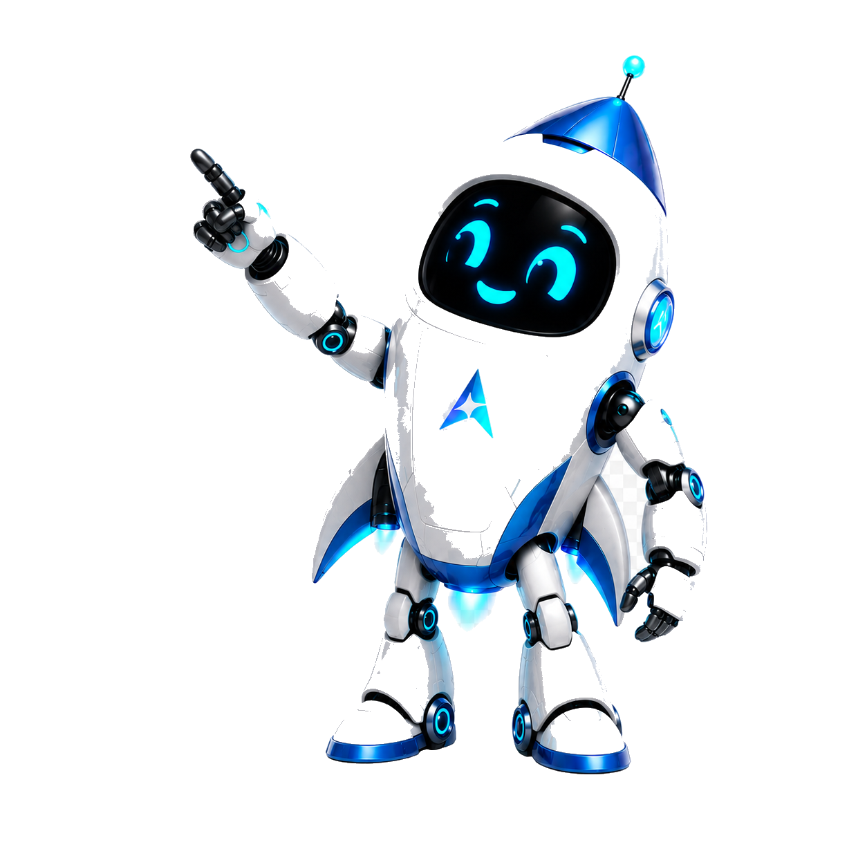
  const imgSrc = covered ? 'assets/galaxia-mascot-blank-v6.png' : 'assets/galaxia-mascot.png';

  // ── Drawing helpers ───────────────────────────────────────────
  // Friendly cyan "happy" eye glyph — drawn in screen coords.
  // Renders a glowing lens-shape (lemon outline) so the eye looks like
  // the original closed-arc happy face, with a pupil inside that tracks.
  const HappyEye = ({ cx, cy, mirror = false }) => {
    const W = 64;   // half-width
    const HT = 30;  // top curve height
    const HB = 6;   // bottom curve depth
    // Lemon-shaped path with a slight upturn at the OUTER corner.
    // mirror=true flips the upturn for the right eye.
    const tipL = mirror ? cx - W      : cx - W - 2;
    const tipR = mirror ? cx + W + 2  : cx + W;
    const lift = mirror ? -3 : -3;
    return (
      <g key={`eye-${cx}-${blinkKey}`} className="gm-eye-blink"
         style={{ transformOrigin: `${cx}px ${cy}px`, transformBox: 'fill-box' }}>
        {/* Soft halo behind the eye */}
        <ellipse cx={cx} cy={cy} rx={W + 4} ry={HT + 4}
          fill="url(#gm-eyeHalo)" opacity="0.55" />
        {/* Main happy lens — solid cyan */}
        <path d={`M ${tipL} ${cy + lift}
                  Q ${cx} ${cy - HT} ${tipR} ${cy + lift}
                  Q ${cx} ${cy + HB} ${tipL} ${cy + lift} Z`}
          fill="url(#gm-eyeFill)"
          style={{ filter: 'drop-shadow(0 0 12px #5BD5F2)' }} />
        {/* Inner highlight band — softens the top edge into a smile */}
        <path d={`M ${cx - W * 0.55} ${cy - 4}
                  Q ${cx} ${cy - HT * 0.62} ${cx + W * 0.55} ${cy - 4}`}
          stroke="#F4FCFF" strokeWidth="3" fill="none" strokeLinecap="round"
          opacity="0.7" />
        {/* Pupil — tracks mouse via the wrapping g translate */}
        <g ref={mirror ? rightEyeRef : leftEyeRef}>
          <circle cx={cx} cy={cy} r="9.5" fill="#0A1218" opacity="0.92" />
          <circle cx={cx} cy={cy} r="6"   fill="url(#gm-pupilGrad)"
            style={{ filter: 'drop-shadow(0 0 5px #5BD5F2)' }} />
          <circle cx={cx - 2} cy={cy - 2} r="2.4" fill="#F4FCFF" opacity="0.95" />
        </g>
      </g>
    );
  };

  return (
    <div ref={rootRef} className="relative pointer-events-none select-none"
      style={{ width: size, animation: 'oc-float 5.2s ease-in-out infinite' }}>
      {/* Halo behind the whole mascot */}
      <div aria-hidden="true"
        className="absolute left-1/2 top-1/2 -z-10"
        style={{
          width: size * 1.55, height: size * 1.55,
          transform: 'translate(-50%, -52%)', borderRadius: '50%',
          background:
            'radial-gradient(circle, rgba(91,213,242,0.45) 0%, rgba(51,194,234,0.15) 40%, rgba(51,194,234,0) 72%)',
          animation: 'oc-halo 4s ease-in-out infinite'
        }} />

      {/* 3D tilt wrapper */}
      <div ref={innerRef}
        style={{
          width: size, transformStyle: 'preserve-3d',
          transition: 'transform 60ms linear',
          willChange: 'transform'
        }}>
        <img src={imgSrc} alt="GalaxIA"
          width={size}
          style={{
            width: size, height: 'auto', display: 'block',
            filter: 'drop-shadow(0 16px 28px rgba(51,194,234,0.35)) drop-shadow(0 0 16px rgba(91,213,242,0.4))'
          }} />

        <svg className="absolute inset-0 pointer-events-none"
          viewBox="0 0 792 1109"
          preserveAspectRatio="xMidYMid meet"
          style={{ width: size }}>
          <defs>
            <radialGradient id="gm-eyeHalo" cx="50%" cy="50%" r="50%">
              <stop offset="0%"  stopColor="#DCF5FC" stopOpacity="0.95" />
              <stop offset="55%" stopColor="#5BD5F2" stopOpacity="0.8" />
              <stop offset="100%" stopColor="rgba(51,194,234,0)" />
            </radialGradient>
            <linearGradient id="gm-eyeFill" x1="0" y1="0" x2="0" y2="1">
              <stop offset="0%"  stopColor="#9BEAF7" />
              <stop offset="50%" stopColor="#5BD5F2" />
              <stop offset="100%" stopColor="#1FB0DA" />
            </linearGradient>
            <radialGradient id="gm-pupilGrad" cx="40%" cy="40%" r="60%">
              <stop offset="0%"  stopColor="#F4FCFF" />
              <stop offset="60%" stopColor="#5BD5F2" />
              <stop offset="100%" stopColor="#1FB0DA" />
            </radialGradient>
            <radialGradient id="gm-flame" cx="50%" cy="80%" r="60%">
              <stop offset="0%"   stopColor="#F4FCFF" stopOpacity="1"   />
              <stop offset="35%"  stopColor="#5BD5F2" stopOpacity="0.95" />
              <stop offset="75%"  stopColor="#1FB0DA" stopOpacity="0.55" />
              <stop offset="100%" stopColor="rgba(51,194,234,0)" />
            </radialGradient>
            <radialGradient id="gm-antennaGlow" cx="50%" cy="50%" r="50%">
              <stop offset="0%"  stopColor="#F4FCFF" stopOpacity="0.95" />
              <stop offset="50%" stopColor="#5BD5F2" stopOpacity="0.75" />
              <stop offset="100%" stopColor="rgba(51,194,234,0)" />
            </radialGradient>
          </defs>

          {/* ── Rocket exhaust under the feet ─────────────────────
              Two animated flame plumes + 4 rising embers. Positioned
              over the static flame already painted in the image so
              they ride along, intensify and shimmer. */}
          <g style={{ mixBlendMode: 'screen' }}>
            {[{ cx: 360 }, { cx: 470 }].map((f, i) => (
              <ellipse key={i}
                cx={f.cx} cy={1010} rx={36} ry={68}
                fill="url(#gm-flame)"
                style={{
                  transformOrigin: `${f.cx}px 1010px`, transformBox: 'fill-box',
                  animation: `gm-flame ${0.5 + i * 0.07}s ease-in-out infinite alternate`,
                  filter: 'blur(1px)'
                }} />
            ))}
            {/* Rising embers */}
            {[
              { x: 358, dur: 1.8, delay: 0.0 },
              { x: 384, dur: 2.3, delay: 0.7 },
              { x: 446, dur: 2.0, delay: 0.3 },
              { x: 472, dur: 2.5, delay: 1.2 },
            ].map((p, i) => (
              <circle key={`em${i}`} cx={p.x} cy={1080} r="3.2"
                fill="#9BEAF7"
                style={{
                  animation: `gm-ember ${p.dur}s linear ${p.delay}s infinite`,
                  filter: 'drop-shadow(0 0 7px #5BD5F2)'
                }} />
            ))}
          </g>

          {/* ── Antenna ball — pulsing glow on top of the existing ball */}
          <g style={{ transformOrigin: '538px 56px', transformBox: 'fill-box',
                      animation: 'gm-antenna 2.8s ease-in-out infinite' }}>
            <circle cx="538" cy="56" r="26" fill="url(#gm-antennaGlow)" opacity="0.85" />
            <circle cx="538" cy="56" r="14" fill="#F4FCFF" opacity="0.95"
              style={{ filter: 'drop-shadow(0 0 10px #5BD5F2)' }} />
          </g>

          {/* ── Face: friendly eyes + smile (only when covered) ── */}
          {covered && (
            <React.Fragment>
              <HappyEye cx={eyes.cxL} cy={eyes.cy} mirror={false} />
              <HappyEye cx={eyes.cxR} cy={eyes.cy} mirror={true}  />

              {/* Smile — wider, slightly upturned ends — gently "breathes" */}
              <g style={{ transformOrigin: `${396 + SHIFT_X}px 420px`,
                          transformBox: 'fill-box',
                          animation: 'gm-smile 5.8s ease-in-out infinite' }}>
                <path d={`M ${346 + SHIFT_X} 408
                          Q ${396 + SHIFT_X} 458 ${446 + SHIFT_X} 408`}
                  stroke="#5BD5F2" strokeWidth="10" fill="none" strokeLinecap="round"
                  style={{ filter: 'drop-shadow(0 0 10px #33C2EA)' }} />
                {/* Inner highlight on the smile */}
                <path d={`M ${360 + SHIFT_X} 416
                          Q ${396 + SHIFT_X} 446 ${432 + SHIFT_X} 416`}
                  stroke="#F4FCFF" strokeWidth="3" fill="none" strokeLinecap="round"
                  opacity="0.7" />
              </g>
            </React.Fragment>
          )}

          {/* ── Two-pupil overlay for the 'dots' mode ──────────── */}
          {!covered && (
            <React.Fragment>
              <g ref={leftEyeRef}>
                <circle cx={eyes.cxL} cy={eyes.cy} r={eyes.pupilR} fill="#0A0A0F" />
                <circle cx={eyes.cxL - 3} cy={eyes.cy - 3} r={3} fill="#F4FCFF" opacity="0.95" />
              </g>
              <g ref={rightEyeRef}>
                <circle cx={eyes.cxR} cy={eyes.cy} r={eyes.pupilR} fill="#0A0A0F" />
                <circle cx={eyes.cxR - 3} cy={eyes.cy - 3} r={3} fill="#F4FCFF" opacity="0.95" />
              </g>
            </React.Fragment>
          )}

          {/* ── Hand wave — micro rotation on the upraised left arm */}
          <g ref={handRef}
            style={{
              transformOrigin: '215px 380px', transformBox: 'fill-box',
              animation: 'gm-wave 3.6s ease-in-out infinite'
            }}>
            {/* Soft cyan glow halo over the hand to amplify the wave */}
            <circle cx="120" cy="430" r="60"
              fill="url(#gm-antennaGlow)" opacity="0.18" />
          </g>
        </svg>
      </div>

      <style>{`
        @keyframes oc-float {
          0%, 100% { transform: translateY(0); }
          50%      { transform: translateY(-6px); }
        }
        @keyframes oc-halo {
          0%, 100% { opacity: 0.8; transform: translate(-50%, -52%) scale(1); }
          50%      { opacity: 1;   transform: translate(-50%, -52%) scale(1.06); }
        }
        @keyframes gm-eye-blink {
          0%, 60%, 100% { transform: scaleY(1); }
          80%           { transform: scaleY(0.08); }
        }
        .gm-eye-blink { animation: gm-eye-blink 220ms cubic-bezier(0.4,0,0.6,1) both; }
        @keyframes gm-smile {
          0%, 100% { transform: scaleX(1)    scaleY(1);    }
          50%      { transform: scaleX(1.04) scaleY(1.08); }
        }
        @keyframes gm-antenna {
          0%, 100% { transform: translateY(0)    scale(1);    opacity: 1;   }
          50%      { transform: translateY(-1.5px) scale(1.10); opacity: 0.85; }
        }
        @keyframes gm-flame {
          0%   { transform: scaleY(0.92) scaleX(1.00); opacity: 0.75; }
          50%  { transform: scaleY(1.08) scaleX(0.94); opacity: 1;    }
          100% { transform: scaleY(0.96) scaleX(1.04); opacity: 0.85; }
        }
        @keyframes gm-ember {
          0%   { transform: translateY(0)     scale(1);   opacity: 0;   }
          10%  { opacity: 1; }
          80%  { opacity: 0.55; }
          100% { transform: translateY(-90px) scale(0.4); opacity: 0;   }
        }
        @keyframes gm-wave {
          0%, 70%, 100% { transform: rotate(0deg);   }
          80%           { transform: rotate(7deg);   }
          90%           { transform: rotate(-3deg);  }
        }
        @media (prefers-reduced-motion: reduce){
          [style*="oc-float"], [style*="oc-halo"], .gm-eye-blink,
          [style*="gm-smile"], [style*="gm-antenna"], [style*="gm-flame"],
          [style*="gm-ember"], [style*="gm-wave"] { animation: none !important; }
        }
      `}</style>
    </div>
  );
}

/* ─────────────────────────────────────────────────────────────
   Variant A — Operational Core (rotating ring, no lines)
   Cards orbit the mascot — full revolution every 12s (≈ one chip
   step every 2s). No connector lines: motion + glow alone carry
   the "system alive" feeling.
   ────────────────────────────────────────────────────────────── */

/* Card · Pods — vertical glass capsule with LED + big icon */
function PodCard({ step }) {
  return (
    <div className="relative w-[120px] rounded-[22px] overflow-hidden"
      style={{
        background:
          'linear-gradient(180deg, rgba(91,213,242,0.08) 0%, rgba(244,241,234,0.03) 50%, rgba(10,10,15,0.6) 100%)',
        border: '1px solid rgba(91,213,242,0.32)',
        boxShadow:
          '0 0 0 1px rgba(91,213,242,0.12) inset, 0 18px 32px -16px rgba(0,0,0,0.6), 0 0 28px rgba(51,194,234,0.18)',
        backdropFilter: 'blur(14px) saturate(140%)',
        WebkitBackdropFilter: 'blur(14px) saturate(140%)'
      }}>
      {/* Top highlight bar */}
      <div aria-hidden="true"
        className="absolute inset-x-3 top-0 h-px"
        style={{ background: 'linear-gradient(to right, transparent, rgba(91,213,242,0.85), transparent)',
                 boxShadow: '0 0 8px rgba(91,213,242,0.7)' }} />
      {/* Live LED dot */}
      <div className="absolute top-2.5 left-3 flex items-center gap-1.5">
        <span className="relative flex size-1.5">
          <span className="absolute inset-0 rounded-full bg-cyan animate-ping opacity-75" />
          <span className="relative rounded-full bg-cyan size-1.5"
                style={{ boxShadow: '0 0 8px rgba(51,194,234,0.95)' }} />
        </span>
        <span className="font-mono text-[7.5px] uppercase tracking-[0.32em] text-cyan/75">on</span>
      </div>
      {/* Code ticker */}
      <div className="absolute top-2.5 right-3 font-mono text-[8px] tracking-[0.18em] text-ink/40">
        N{(SYSTEM_STEPS.findIndex(s => s.id === step.id) + 1).toString().padStart(2,'0')}
      </div>
      <div className="relative px-3.5 pt-7 pb-3.5 flex flex-col items-center gap-2.5">
        <div className="text-cyan grid place-items-center size-9 rounded-full"
             style={{ background: 'radial-gradient(circle, rgba(91,213,242,0.20), transparent 70%)' }}>
          <SysIcon name={step.icon} size={22} />
        </div>
        <div className="text-center leading-tight">
          <div className="font-mono text-[11px] uppercase tracking-[0.18em] text-ink">{step.label}</div>
          <div className="font-mono text-[9px] text-ink/55 mt-0.5">{step.sub}</div>
        </div>
      </div>
    </div>
  );
}

/* Card · Tactical — wide bracketed terminal module */
function TacticalCard({ step }) {
  const n = (SYSTEM_STEPS.findIndex(s => s.id === step.id) + 1).toString().padStart(2,'0');
  return (
    <div className="relative w-[172px]"
      style={{
        background:
          'linear-gradient(180deg, rgba(10,10,15,0.92), rgba(10,10,15,0.86))',
        border: '1px solid rgba(91,213,242,0.45)',
        boxShadow:
          '0 0 0 1px rgba(10,10,15,0.6) inset, 0 0 22px rgba(51,194,234,0.25), 0 14px 24px -12px rgba(0,0,0,0.7)'
      }}>
      {/* Faint scanline texture */}
      <div aria-hidden="true" className="absolute inset-0 pointer-events-none"
        style={{
          backgroundImage:
            'repeating-linear-gradient(0deg, rgba(91,213,242,0.04) 0 1px, transparent 1px 4px)',
          mixBlendMode: 'screen', opacity: 0.6
        }} />
      {/* Corner brackets */}
      {[
        { c: 'top-0 left-0',     borderClass: 'border-t-2 border-l-2' },
        { c: 'top-0 right-0',    borderClass: 'border-t-2 border-r-2' },
        { c: 'bottom-0 left-0',  borderClass: 'border-b-2 border-l-2' },
        { c: 'bottom-0 right-0', borderClass: 'border-b-2 border-r-2' },
      ].map((b, i) => (
        <span key={i} aria-hidden="true"
          className={`absolute ${b.c} size-3 ${b.borderClass}`}
          style={{ borderColor: 'rgba(91,213,242,0.95)',
                   boxShadow: '0 0 6px rgba(51,194,234,0.7)' }} />
      ))}
      {/* Body */}
      <div className="relative flex items-center gap-3 px-3 py-2.5">
        <div className="grid place-items-center size-9 rounded-sm text-cyan"
          style={{ background: 'rgba(51,194,234,0.10)',
                   border: '1px solid rgba(91,213,242,0.35)' }}>
          <SysIcon name={step.icon} size={18} />
        </div>
        <div className="flex-1 min-w-0">
          <div className="font-mono text-[11px] uppercase tracking-[0.20em] text-ink truncate">{step.label}</div>
          <div className="font-mono text-[9px] tracking-[0.12em] text-ink/55 truncate">{step.sub}</div>
        </div>
      </div>
      {/* Footer line: address + live tick */}
      <div className="relative flex items-center justify-between px-3 pb-1.5">
        <span className="font-mono text-[7.5px] tracking-[0.28em] text-ink/35">{`>> N${n}`}</span>
        <span className="inline-flex items-center gap-1">
          <span className="size-[5px] rounded-sm bg-cyan animate-pulse"
                style={{ boxShadow: '0 0 6px rgba(51,194,234,0.9)' }} />
          <span className="font-mono text-[7.5px] tracking-[0.28em] text-cyan">LIVE</span>
        </span>
      </div>
    </div>
  );
}

/* Card · Benefit — premium pod with a big number front-and-center.
   Used by the orbital while it rotates around the brand video.        */
function BenefitCard({ b }) {
  return (
    <div className="relative w-[136px] rounded-[22px] overflow-hidden ng-ignite"
      style={{
        // Solid dark fill — covers the underlying video edge cleanly.
        background:
          'linear-gradient(180deg, rgba(14,18,28,0.99) 0%, rgba(10,12,18,1) 50%, rgba(8,9,14,1) 100%)',
      }}>
      {/* Subtle cyan tint overlay — gives the glassy hint without translucency */}
      <div aria-hidden="true" className="absolute inset-0 pointer-events-none"
        style={{
          background:
            'linear-gradient(180deg, rgba(91,213,242,0.08) 0%, rgba(91,213,242,0.0) 55%)'
        }} />
      {/* Top highlight bar */}
      <div aria-hidden="true"
        className="absolute inset-x-3 top-0 h-px"
        style={{ background: 'linear-gradient(to right, transparent, rgba(91,213,242,0.85), transparent)',
                 boxShadow: '0 0 8px rgba(91,213,242,0.7)' }} />
      {/* Live LED dot */}
      <div className="absolute top-2.5 left-3 flex items-center gap-1.5">
        <span className="relative flex size-1.5">
          <span className="absolute inset-0 rounded-full bg-cyan animate-ping opacity-75" />
          <span className="relative rounded-full bg-cyan size-1.5"
                style={{ boxShadow: '0 0 8px rgba(51,194,234,0.95)' }} />
        </span>
        <span className="font-mono text-[7.5px] uppercase tracking-[0.32em] text-cyan/75">on</span>
      </div>
      {/* Index */}
      <div className="absolute top-2.5 right-3 font-mono text-[8px] tracking-[0.18em] text-ink/40">
        N{(BENEFITS.findIndex(x => x.id === b.id) + 1).toString().padStart(2, '0')}
      </div>
      <div className="relative px-3 pt-7 pb-3.5 flex flex-col items-center gap-1.5">
        <div className="text-cyan grid place-items-center size-8 rounded-full ng-ignite-halo"
             style={{ background: 'radial-gradient(circle, rgba(91,213,242,0.32), transparent 70%)' }}>
          <SysIcon name={b.icon} size={20} />
        </div>
        <div className="font-serif text-[28px] leading-none text-ink ng-ignite-text"
             style={{ fontFamily: '"Instrument Serif", serif' }}>
          {b.value}
        </div>
        <div className="font-mono text-[9.5px] uppercase tracking-[0.18em] text-ink/95 text-center leading-tight">
          {b.label}
        </div>
        <div className="font-mono text-[8.5px] text-ink/55 text-center leading-tight">
          {b.sub}
        </div>
      </div>
    </div>
  );
}

/* ─────────────────────────────────────────────────────────────
   OperationalCorePerimeter — v3-only orbital path.
   Cards travel a single continuous rounded-rectangle path around
   the video. Card center sits 5px inside the video edge so each
   card just barely overlaps the rectangle, covering most of the
   visible border without intruding on the mascot.
   ────────────────────────────────────────────────────────────── */
function OperationalCorePerimeter() {
  /* V3 polish ADDENDUM (2026-05-18) — segunda reducción tras feedback de
     Codex/Martin: video dominaba demasiado, bordes muy visibles. Bajamos
     videoW 400→300 (escala adicional 0.75) y aire entre cards. Breakpoint
     xl mantiene (orbital solo ≥1280) y dimensiones calibradas para que en
     ese viewport quede ~50px de margen real en el slot xl:col-span-6 (552).
     Originales template: containerW=920, H=720, video 640×360, cards
     136×156, TOTAL=12. Reducción final ~0.47× video, 0.59× cards, TOTAL=8. */
  const containerW = 540;
  const containerH = 400;
  const videoW = 300, videoH = 170;
  const cardW = 80, cardH = 96;
  const overlap = 4;          // px the card body crosses INTO the video

  const cy0       = containerH / 2 - 30;                    // raised 30px so the
                                                            // hero composition feels
                                                            // visually centered with
                                                            // headline copy above.
  const halfPathW = videoW / 2 + (cardW / 2 - overlap);     // 186
  const halfPathH = videoH / 2 + (cardH / 2 - overlap);     // 129
  const r         = 28;                                     // corner radius (was 40)
  const sW        = 2 * halfPathW - 2 * r;                  // top/bot straight length
  const sH        = 2 * halfPathH - 2 * r;                  // left/right straight length
  const arcLen    = (Math.PI / 2) * r;
  const perim     = 2 * sW + 2 * sH + 4 * arcLen;

  const TOTAL     = 8;                                      // V3: matches BENEFITS.length
  const PERIOD_MS = 28000;

  const slotRefs = useRefV2([]);
  if (slotRefs.current.length !== TOTAL) slotRefs.current = Array(TOTAL).fill(null);

  // Convert t∈[0,1] → (xRel, y) on the rounded rectangle.
  const posAt = (t) => {
    let d = (((t % 1) + 1) % 1) * perim;
    // 0 — TOP straight
    if (d <= sW) return { x: -halfPathW + r + d, y: cy0 - halfPathH };
    d -= sW;
    // 1 — TOP-RIGHT arc
    if (d <= arcLen) {
      const a = (d / arcLen) * (Math.PI / 2) - Math.PI / 2;
      return {
        x: (halfPathW - r) + r * Math.cos(a),
        y: (cy0 - halfPathH + r) + r * Math.sin(a),
      };
    }
    d -= arcLen;
    // 2 — RIGHT straight
    if (d <= sH) return { x: halfPathW, y: cy0 - halfPathH + r + d };
    d -= sH;
    // 3 — BOTTOM-RIGHT arc
    if (d <= arcLen) {
      const a = (d / arcLen) * (Math.PI / 2);
      return {
        x: (halfPathW - r) + r * Math.cos(a),
        y: (cy0 + halfPathH - r) + r * Math.sin(a),
      };
    }
    d -= arcLen;
    // 4 — BOTTOM straight
    if (d <= sW) return { x: halfPathW - r - d, y: cy0 + halfPathH };
    d -= sW;
    // 5 — BOTTOM-LEFT arc
    if (d <= arcLen) {
      const a = (d / arcLen) * (Math.PI / 2) + Math.PI / 2;
      return {
        x: (-halfPathW + r) + r * Math.cos(a),
        y: (cy0 + halfPathH - r) + r * Math.sin(a),
      };
    }
    d -= arcLen;
    // 6 — LEFT straight
    if (d <= sH) return { x: -halfPathW, y: cy0 + halfPathH - r - d };
    d -= sH;
    // 7 — TOP-LEFT arc
    const a = (d / arcLen) * (Math.PI / 2) + Math.PI;
    return {
      x: (-halfPathW + r) + r * Math.cos(a),
      y: (cy0 - halfPathH + r) + r * Math.sin(a),
    };
  };

  useEffectV2(() => {
    const reduce = window.matchMedia('(prefers-reduced-motion: reduce)').matches;
    if (reduce) {
      for (let i = 0; i < TOTAL; i++) {
        const el = slotRefs.current[i];
        if (!el) continue;
        const p = posAt(i / TOTAL);
        el.style.top  = `${p.y.toFixed(1)}px`;
        el.style.left = `calc(50% + ${p.x.toFixed(1)}px)`;
        el.style.opacity = '1';
      }
      return;
    }
    let raf = 0;
    const t0 = performance.now();
    const loop = (now) => {
      const baseT = (now - t0) / PERIOD_MS;
      for (let i = 0; i < TOTAL; i++) {
        const el = slotRefs.current[i];
        if (!el) continue;
        const t = (baseT + i / TOTAL) % 1;
        const p = posAt(t);
        el.style.top  = `${p.y.toFixed(1)}px`;
        el.style.left = `calc(50% + ${p.x.toFixed(1)}px)`;
        el.style.opacity = '1';
      }
      raf = requestAnimationFrame(loop);
    };
    raf = requestAnimationFrame(loop);
    return () => cancelAnimationFrame(raf);
  }, []);

  return (
    <div className="relative w-full mx-auto"
      style={{ height: containerH, maxWidth: containerW }}>
      {/* Brand video — raised 80px from container center. */}
      <div className="absolute left-1/2 -translate-x-1/2 -translate-y-1/2"
           style={{ top: `${cy0}px`, zIndex: 10 }}>
        <GalaxiaVideo width={videoW} height={videoH} />
      </div>
      {/* Cards on the perimeter — always alpha=1; updated per rAF tick. */}
      {Array.from({ length: TOTAL }).map((_, i) => (
        <div key={i} className="absolute"
          ref={(el) => { slotRefs.current[i] = el; }}
          style={{
            top: 0, left: '50%',
            transform: 'translate(-50%, -50%)',
            zIndex: 20,
            willChange: 'top, left'
          }}>
          <BenefitCard b={BENEFITS[i % BENEFITS.length]} />
        </div>
      ))}
    </div>
  );
}

/* ─────────────────────────────────────────────────────────────
   V3 polish ADDENDUM (2026-05-18) — nueva dirección
   ─────────────────────────────────────────────────────────────
   GalaxiaVideo retirado del hero (movido al Footer).
   Composición nueva: mascot GalaxIA fijo abajo-derecha apuntando hacia
   arriba-izquierda, una tarjeta grande destacada donde apunta + 4 chips
   queue de las capacidades próximas. El featured card rota a través de
   las 8 capacidades en ciclo, sin repetir simultáneamente.
   ────────────────────────────────────────────────────────────── */
/* V3 polish ADDENDUM 2 — UX/UI Pro Max (2026-05-18)
   Card premium glass-cyber, mucho más grande (320×220), icono prominente,
   verbo serif 42px con glow medido, label cyan/mono, sub legible.
   Reemplaza el chip pequeño anterior que no se veía premium. */
function FeaturedBenefitCard({ b }) {
  return (
    <div className="relative w-[320px] h-[220px] rounded-[24px] overflow-hidden"
      style={{
        background:
          'linear-gradient(180deg, rgba(14,18,28,0.98) 0%, rgba(10,12,18,1) 50%, rgba(8,9,14,1) 100%)',
        animation: 'gx-card-fade 800ms cubic-bezier(0.65,0,0.35,1) both',
        boxShadow:
          '0 0 0 1px rgba(91,213,242,0.30) inset,' +
          ' 0 24px 48px -16px rgba(0,0,0,0.75),' +
          ' 0 0 60px rgba(51,194,234,0.18)'
      }}>
      {/* Inner glow corners (cyan TL + violet faint BR) para profundidad */}
      <div aria-hidden="true" className="absolute inset-0 pointer-events-none"
        style={{
          background:
            'radial-gradient(circle at 18% 22%, rgba(91,213,242,0.20), transparent 55%),' +
            'radial-gradient(circle at 85% 90%, rgba(158,123,255,0.08), transparent 60%)'
        }} />
      {/* Top highlight bar — cyan scan suave */}
      <div aria-hidden="true" className="absolute inset-x-6 top-0 h-px"
        style={{
          background: 'linear-gradient(to right, transparent, rgba(91,213,242,1), transparent)',
          boxShadow: '0 0 10px rgba(91,213,242,0.85)'
        }} />
      {/* Bottom subtle accent */}
      <div aria-hidden="true" className="absolute inset-x-6 bottom-0 h-px"
        style={{ background: 'linear-gradient(to right, transparent, rgba(91,213,242,0.45), transparent)' }} />
      {/* TL: ON LED + label */}
      <div className="absolute top-4 left-6 flex items-center gap-2 z-10">
        <span className="relative flex size-1.5">
          <span className="absolute inset-0 rounded-full bg-cyan animate-ping opacity-75" />
          <span className="relative rounded-full bg-cyan size-1.5"
                style={{ boxShadow: '0 0 8px rgba(51,194,234,0.95)' }} />
        </span>
        <span className="font-mono text-[9px] uppercase tracking-[0.32em] text-cyan/85">
          capacidad · live
        </span>
      </div>
      {/* TR: Index "N0X / 08" — UX/UI: muestra posición y total */}
      <div className="absolute top-4 right-6 font-mono text-[9px] tracking-[0.22em] text-ink/55 z-10">
        N{(BENEFITS.findIndex(x => x.id === b.id) + 1).toString().padStart(2, '0')}
        <span className="text-ink/30"> / 08</span>
      </div>
      {/* Body — left-aligned premium typography */}
      <div className="absolute inset-0 px-6 pt-14 pb-5 flex flex-col items-start gap-2 z-10">
        <div className="text-cyan grid place-items-center size-14 rounded-2xl"
          style={{
            background: 'radial-gradient(circle, rgba(91,213,242,0.30), rgba(91,213,242,0.04) 70%)',
            border: '1px solid rgba(91,213,242,0.30)',
            boxShadow: '0 0 22px rgba(51,194,234,0.20), inset 0 0 12px rgba(91,213,242,0.08)'
          }}>
          <SysIcon name={b.icon} size={28} />
        </div>
        <div className="flex flex-col gap-0.5 mt-1">
          <div className="font-serif text-[42px] leading-[0.92] text-ink"
            style={{
              fontFamily: '"Instrument Serif", serif',
              textShadow: '0 0 24px rgba(91,213,242,0.45)'
            }}>
            {b.value}
          </div>
          <div className="font-mono text-[11.5px] uppercase tracking-[0.20em] text-cyan/85">
            {b.label}
          </div>
          <div className="text-[12.5px] text-ink/72 leading-[1.45] max-w-[260px] mt-0.5">
            {b.sub}
          </div>
        </div>
      </div>
    </div>
  );
}

function HeroFeaturedCarousel() {
  /* V3 polish ADDENDUM 2 (2026-05-18) — UX/UI Pro Max:
     - GalaxIA más chico (200px width vs 240px previo).
     - Card destacada mucho más grande (320×220 vs 180×~auto previo).
     - Composición: card upper-left, mascot bottom-right con finger pointing
       up-left hacia la card. Overlap parcial intencionado.
     - Queue chips reemplazados por stepper indicator de 8 segmentos (más
       elegante, comunica "carrusel" sin saturar).
     - Asset transparente real (galaxia-pointing-transparent.png con alpha
       generado vía PIL eliminando el checkerboard de la fuente RGB). */
  const containerW = 580;
  const containerH = 440;
  const CYCLE_MS = 4200;             // 4.2s × 8 = 33.6s ciclo completo (premium pace)
  const [activeIdx, setActiveIdx] = useStateV2(0);

  useEffectV2(() => {
    if (window.matchMedia && window.matchMedia('(prefers-reduced-motion: reduce)').matches) return;
    const id = setInterval(() => {
      setActiveIdx(i => (i + 1) % BENEFITS.length);
    }, CYCLE_MS);
    return () => clearInterval(id);
  }, []);

  const featured = BENEFITS[activeIdx];

  /* V3 polish ADDENDUM 3 (2026-05-18) — el video reaparece en el hero pero
     ahora como HALO difuminado de marca detrás de la card y el mascot.
     Mask muy agresiva + opacity 0.55 + scale grande para que sea TEXTURA, no
     rectángulo. Posicionado ligeramente desplazado hacia el mascot para
     reforzar el foco diagonal card → mascot. */
  const heroHaloMask =
    'radial-gradient(ellipse 50% 56% at 50% 50%,' +
      ' #000 0%, #000 6%,' +
      ' rgba(0,0,0,0.78) 22%, rgba(0,0,0,0.52) 38%,' +
      ' rgba(0,0,0,0.30) 54%, rgba(0,0,0,0.14) 70%,' +
      ' rgba(0,0,0,0.05) 84%, transparent 100%)';

  return (
    <div className="relative w-full mx-auto"
      style={{ height: containerH, maxWidth: containerW }}>

      {/* Halo de video — capa z=0, detrás de todo. Funciona como brand motion
          texture, no como protagonista. Más grande que el container y desplazado
          hacia el cuadrante donde está el mascot para dar profundidad direccional. */}
      <div className="absolute pointer-events-none select-none" aria-hidden="true"
        style={{
          right: -60, bottom: -40,
          width: 460, height: 260,
          zIndex: 0, opacity: 0.55
        }}>
        <div className="absolute inset-0 overflow-hidden"
          style={{ WebkitMaskImage: heroHaloMask, maskImage: heroHaloMask }}>
          <video
            src="assets/galaxia-video.mp4"
            autoPlay muted loop playsInline preload="metadata"
            style={{
              position: 'absolute',
              top: '50%', left: '50%',
              width: '125%', height: '125%',
              transform: 'translate(calc(-50% - 6%), calc(-50% - 5.5%))',
              objectFit: 'cover',
              filter: 'brightness(0.88) contrast(1.18) saturate(1.08) blur(1.5px)',
              mixBlendMode: 'screen'
            }} />
        </div>
        {/* Overlay con bg-color radial — borra pixels lit cerca del borde. */}
        <div className="absolute inset-0 pointer-events-none"
          style={{
            background:
              'radial-gradient(ellipse 56% 60% at 50% 50%,' +
                ' rgba(10,10,15,0) 0%, rgba(10,10,15,0) 18%,' +
                ' rgba(10,10,15,0.32) 34%, rgba(10,10,15,0.62) 50%,' +
                ' rgba(10,10,15,0.86) 68%, rgba(10,10,15,1) 86%,' +
                ' rgba(10,10,15,1) 100%)'
          }} />
      </div>

      {/* Featured card — sweet spot upper-left, en la dirección a la que apunta
          el dedo de GalaxIA (up-left desde su posición bottom-right). El
          `key={featured.id}` fuerza remontaje en cada tick → crossfade limpio.
          Sin tarjetas repetidas simultáneamente (única card visible a la vez). */}
      <div className="absolute z-10" style={{ left: 50, top: 36 }}>
        <FeaturedBenefitCard b={featured} key={featured.id} />
      </div>

      {/* Mascot GalaxIA — bottom-right, más chico que antes (200px), con
          asset transparente real. Overlap parcial intencionado sobre la card
          en el área inferior-derecha. Z superior para que el finger quede al
          frente del visual. Sin glow excesivo (drop-shadow medido). */}
      <div className="absolute z-20 pointer-events-none select-none"
        style={{ right: 16, bottom: 8, width: 200 }}>
        <img src="assets/galaxia-pointing-transparent.png" alt="GalaxIA"
          style={{
            width: '100%', height: 'auto', display: 'block',
            filter:
              'drop-shadow(0 18px 32px rgba(0,0,0,0.45))' +
              ' drop-shadow(0 0 28px rgba(91,213,242,0.28))',
            animation: 'gx-bob 5.6s ease-in-out infinite'
          }} />
      </div>

      {/* Stepper indicator — 8 segmentos bottom-left bajo la card. Activo es
          más ancho + cyan glow; resto son outlines tenues. Comunica "carrusel
          de 8 capacidades" sin saturar el visual con queue chips o mini cards. */}
      <div className="absolute z-10 flex items-center gap-1.5"
        style={{ left: 62, bottom: 18 }}>
        {BENEFITS.map((_, i) => (
          <span key={i}
            className="block rounded-full transition-all duration-[600ms] ease-out"
            style={{
              width: i === activeIdx ? 26 : 10,
              height: 3,
              background: i === activeIdx
                ? 'rgba(91,213,242,0.95)'
                : 'rgba(244,241,234,0.18)',
              boxShadow: i === activeIdx ? '0 0 10px rgba(51,194,234,0.85)' : 'none'
            }} />
        ))}
      </div>

      <style>{`
        @keyframes gx-card-fade {
          0%   { opacity: 0; transform: translateY(12px) scale(0.965); }
          60%  { opacity: 1; }
          100% { opacity: 1; transform: translateY(0) scale(1); }
        }
        @keyframes gx-bob {
          0%, 100% { transform: translateY(0); }
          50%      { transform: translateY(-5px); }
        }
        @media (prefers-reduced-motion: reduce){
          [style*="gx-bob"], [style*="gx-card-fade"] { animation: none !important; }
        }
      `}</style>
    </div>
  );
}

function OperationalCore({ style = 'pods', eyesStyle = 'covered' }) {
  // ── Perimeter mode (v3) ──────────────────────────────────────────
  // When the host page sets `window.__NG_PERIMETER = true`, cards stop
  // falling in two vertical columns and instead orbit the video as a
  // single fluid rectangle: top → right → bottom → left → repeat.
  // Each card center traces a rounded-rectangle path 5px inside the
  // video edge, so the cards barely overlap the rectangle and cover
  // most of the visible border without intruding on the mascot.
  const PERIMETER_MODE = typeof window !== 'undefined' && window.__NG_PERIMETER === true;

  if (PERIMETER_MODE) {
    return <OperationalCorePerimeter />;
  }
  // Falling-columns design: two vertical columns of benefit cards stream
  // continuously from the top of the hero, pass IN FRONT of the video
  // (each card's center aligned to the video's left/right vertical edge),
  // and fade out below the video down to the bottom of the column.
  // A new card fades in from the top as one fades out at the bottom —
  // the stream is endless.
  const NUM_PER_SIDE = 5;
  const TOTAL = NUM_PER_SIDE * 2;
  const PERIOD_MS = 22000;

  // Native video is 848×478 (~16:9). We render at 640×360 so even with the
  // GalaxiaVideo internal zoom of 1.22× the source pixels stay below native
  // resolution (~781×439) — no upscaling, no quality loss.
  const containerW = 880;
  const containerH = 620;
  const videoW = 640, videoH = 360;
  // Move the video down inside the column so it sits below the top.
  const videoOffsetY = -150;

  // Vertical lifecycle anchors (px from top of container).
  const cardH      = 156;                              // approx card height
  const startY     = -cardH * 0.5;                     // off-screen above
  const endY       = containerH + cardH * 0.5;         // off-screen below
  const videoTop   = (containerH - videoH) / 2 + videoOffsetY;
  const videoBot   = (containerH + videoH) / 2 + videoOffsetY;

  const slotRefs = useRefV2([]);
  if (slotRefs.current.length !== TOTAL) slotRefs.current = Array(TOTAL).fill(null);

  useEffectV2(() => {
    if (window.matchMedia('(prefers-reduced-motion: reduce)').matches) return;
    let raf = 0;
    const t0 = performance.now();
    const loop = (now) => {
      const baseT = (now - t0) / PERIOD_MS;
      for (let i = 0; i < TOTAL; i++) {
        const el = slotRefs.current[i];
        if (!el) continue;
        const side = i < NUM_PER_SIDE ? 'left' : 'right';
        const indexInSide = i % NUM_PER_SIDE;
        // Cards on both columns travel in sync — same phase per row index
        // so the left and right cards rise together.
        const phaseOffset = indexInSide / NUM_PER_SIDE;
        const t = ((baseT + phaseOffset) % 1 + 1) % 1;

        // BOTTOM → TOP travel: y starts at endY (below the column) and
        // ends at startY (above the column) over the cycle.
        const y = endY - t * (endY - startY);
        // Cards straddle the video's vertical edges: the inner half of each
        // card sits ON the video, physically covering the rectangle edge
        // with a solid surface. As the mascot rises/breathes, the cards
        // ignite in sync (CSS ng-ignite animation).
        const x = side === 'left' ? -videoW / 2 + 20 : +videoW / 2 - 20;

        // Opacity envelope (mirror of the previous top-to-bottom flow):
        //   below the video → fade IN from 0 to 1 as it rises toward the band
        //   on the video band → 1
        //   above the video → fade OUT from 1 to 0 until off-screen
        let alpha;
        if (y > videoBot) {
          alpha = (endY - y) / (endY - videoBot);
        } else if (y > videoTop) {
          alpha = 1;
        } else {
          alpha = (y - startY) / (videoTop - startY);
        }
        alpha = Math.max(0, Math.min(1, alpha));

        el.style.top   = `${y.toFixed(1)}px`;
        el.style.left  = `calc(50% + ${x.toFixed(1)}px)`;
        el.style.opacity = alpha.toFixed(3);
      }
      raf = requestAnimationFrame(loop);
    };
    raf = requestAnimationFrame(loop);
    return () => cancelAnimationFrame(raf);
  }, []);

  return (
    <div className="relative w-full mx-auto"
      style={{ height: containerH, maxWidth: containerW }}>
      {/* Brand video — centered horizontally, shifted up by videoOffsetY. */}
      <div className="absolute left-1/2 -translate-x-1/2 -translate-y-1/2"
           style={{ top: `calc(50% + ${videoOffsetY}px)`, zIndex: 10 }}>
        <GalaxiaVideo width={videoW} height={videoH} />
      </div>

      {/* Falling benefit cards. Each card's top/left/opacity updates per frame.
          z=20 so they always pass in FRONT of the video. */}
      {Array.from({ length: TOTAL }).map((_, i) => (
        <div key={i} className="absolute"
          ref={(el) => { slotRefs.current[i] = el; }}
          style={{
            top: 0, left: '50%',
            transform: 'translate(-50%, -50%)',
            zIndex: 20,
            willChange: 'top, opacity'
          }}>
          <BenefitCard b={BENEFITS[i % BENEFITS.length]} />
        </div>
      ))}
    </div>
  );
}

/* V3 polish ADDENDUM 5 (2026-05-18) — pivot a "video-only" en el hero derecho.
   Por instrucción de Martin/Codex se retiran del hero: mascot GalaxIA, card
   destacada, carrusel rotativo, stepper, chips, FeaturedBenefitCard y
   HeroFeaturedCarousel. El slot derecho ahora muestra SOLO el video como
   halo difuminado. El canvas de puntitos del background vuelve a verse
   (se removió bg-bg del <header>). Una transición suave fade-to-bg cierra
   el hero hacia la sección siguiente sin línea marcada. */
function HeroVideoOnly() {
  const containerW = 580;
  const containerH = 440;
  // Máscara radial muy agresiva — el video tiene que ser textura, no rectángulo.
  const heroHaloMask =
    'radial-gradient(ellipse 50% 56% at 50% 50%,' +
      ' #000 0%, #000 8%,' +
      ' rgba(0,0,0,0.82) 22%, rgba(0,0,0,0.58) 38%,' +
      ' rgba(0,0,0,0.34) 54%, rgba(0,0,0,0.16) 70%,' +
      ' rgba(0,0,0,0.06) 84%, transparent 100%)';
  return (
    <div className="relative w-full mx-auto pointer-events-none select-none"
      style={{ height: containerH, maxWidth: containerW }} aria-hidden="true">
      <div className="absolute inset-0 overflow-hidden"
        style={{ WebkitMaskImage: heroHaloMask, maskImage: heroHaloMask }}>
        <video
          src="assets/galaxia-video.mp4"
          autoPlay muted loop playsInline preload="metadata"
          style={{
            position: 'absolute',
            top: '50%', left: '50%',
            width: '120%', height: '120%',
            transform: 'translate(calc(-50% - 5%), calc(-50% - 5%))',
            objectFit: 'cover',
            filter: 'brightness(0.92) contrast(1.18) saturate(1.08) blur(0.3px)',
            mixBlendMode: 'screen'
          }} />
      </div>
      {/* Overlay bg-color radial — borra cualquier pixel lit residual en bordes
          sin afectar el centro del halo. */}
      <div className="absolute inset-0 pointer-events-none"
        style={{
          background:
            'radial-gradient(ellipse 56% 60% at 50% 50%,' +
              ' rgba(10,10,15,0) 0%, rgba(10,10,15,0) 22%,' +
              ' rgba(10,10,15,0.28) 38%, rgba(10,10,15,0.58) 54%,' +
              ' rgba(10,10,15,0.84) 70%, rgba(10,10,15,0.96) 86%,' +
              ' rgba(10,10,15,1) 100%)'
        }} />
    </div>
  );
}

function HeroOrbital({ eyebrow, headline, subheadline, coreStyle = 'pods', eyesStyle = 'covered' }) {
  const Reveal = window.Reveal;
  /* V3 polish ADDENDUM 8 (2026-05-18) — CENTERED HERO + favicon.
     Hero limpio, narrativo, premium. SIN video, SIN mascot PNG, SIN card,
     SIN carrusel, SIN stepper, SIN chips. Título centrado, subtítulo centrado,
     CTAs centrados, cue centrado apuntando a #agente.
     Background queda gobernado por el canvas global de puntitos (background.jsx
     fixed canvas + .vignette::after overlay) — visible como atmósfera sutil
     en toda la sección sin competir con el copy. */
  return (
    <header id="top" className="relative min-h-screen flex flex-col">
      {/* Contenido del hero — vertical y horizontal centered. max-w-[1100px]
          da márgenes generosos. Padding vertical generoso para aire. gap-7
          uniforme entre bloques narrativos para jerarquía clara. */}
      <div className="relative z-10 flex-1 mx-auto w-full max-w-[1100px] px-6 md:px-10 pt-28 md:pt-36 pb-24
                      flex flex-col items-center justify-center text-center gap-7 md:gap-8">
        <Reveal>
          <Eyebrow text={eyebrow} />
        </Reveal>
        <Reveal delay={100}>
          <HeadlineV2 text={headline} size="lg" />
        </Reveal>
        <Reveal delay={200}>
          <Subheadline text={subheadline} className="mx-auto" />
        </Reveal>
        <Reveal delay={300}>
          <HeroCTAs align="center" />
        </Reveal>
        <Reveal delay={420}>
          <div className="mt-1"><TintineoCue /></div>
        </Reveal>
        {/* V3 polish ADDENDUM 29 (2026-05-18) — AIEmployeesMenu mobile oculto.
            Decisión Martin: los accesos públicos a las landings verticales
            externas quedan ocultos hasta mejorar esas webs. El componente
            sigue exportado a `window.AIEmployeesMenu` (stub que retorna null)
            como dead-code reversible. Para restaurar: descomentar el bloque
            siguiente y reponer el cuerpo de la función en sections.jsx. */}
        {/*
        <Reveal delay={520}>
          <div className="md:hidden w-full max-w-[320px] mx-auto">
            {typeof window !== 'undefined' && window.AIEmployeesMenu
              ? <window.AIEmployeesMenu variant="hero" />
              : null}
          </div>
        </Reveal>
        */}
      </div>

      <style>{`
        @keyframes sc-bounce {
          0%,100% { transform: translateY(0); opacity: 0.6; }
          50%     { transform: translateY(4px); opacity: 1; }
        }
        @media (prefers-reduced-motion: reduce){
          [style*="sc-bounce"] { animation: none !important; }
        }
      `}</style>
    </header>
  );
}

/* ─────────────────────────────────────────────────────────────
   Variant B — Agent Plan Constellation
   Vertical agent plan with 4 phases. Each phase is a glass row with
   status icon + label + source tags. Side chips float in 3D parallax.
   ────────────────────────────────────────────────────────────── */

function PlanRow({ phase, index, current }) {
  const isDone    = index < current;
  const isLive    = index === current;
  const statusIcon =
    isDone    ? '✓'
  : isLive    ? '⚡'
  :             '◌';
  const statusColor =
    isDone    ? 'text-cyan'
  : isLive    ? 'text-cyan'
  :             'text-ink/35';
  return (
    <div className="relative flex items-start gap-4">
      {/* Status icon + line */}
      <div className="flex flex-col items-center pt-2">
        <div className={`relative flex items-center justify-center size-7 rounded-full border transition-all duration-500
                        ${isLive ? 'border-cyan/70 bg-cyan/10 shadow-[0_0_18px_rgba(51,194,234,0.5)]'
                          : isDone ? 'border-cyan/40 bg-cyan/5'
                          : 'border-line bg-glass'}`}>
          <span className={`text-[12px] font-mono ${statusColor}`}>{statusIcon}</span>
          {isLive && (
            <span className="absolute inset-0 rounded-full border border-cyan/60 animate-ping" />
          )}
        </div>
      </div>

      {/* Phase content */}
      <div className="flex-1 pt-1 pb-5">
        <div className="flex items-center gap-2 mb-1">
          <span className="font-mono text-[10px] uppercase tracking-[0.22em] text-ink/55">0{index+1}</span>
          <span className={`font-serif text-[22px] md:text-[24px] tracking-tight leading-tight
                            ${isLive ? 'text-ink' : isDone ? 'text-ink/90' : 'text-ink/55'}`}
                style={{ fontFamily: '"Instrument Serif", serif' }}>
            {phase.label}
          </span>
        </div>
        <div className="text-[12.5px] text-ink/60 mb-2.5">{phase.sub}</div>
        <div className="flex flex-wrap gap-1.5">
          {phase.tags.map(t => (
            <span key={t}
              className={`inline-flex items-center gap-1.5 font-mono text-[9.5px] uppercase tracking-[0.18em]
                          rounded-full px-2 py-0.5 border
                          ${isLive ? 'border-cyan/40 bg-cyan/8 text-ink/90'
                            : isDone ? 'border-cyan/25 bg-cyan/5 text-ink/75'
                            : 'border-line bg-glass text-ink/45'}`}>
              <span className={`size-1 rounded-full ${isLive ? 'bg-cyan' : isDone ? 'bg-cyan/60' : 'bg-ink/30'}`} />
              {t}
            </span>
          ))}
        </div>
      </div>
    </div>
  );
}

function AgentPlanConstellation() {
  const current = useStepLoop(PLAN_PHASES.length, 1700);

  return (
    <div className="relative w-full mx-auto" style={{ maxWidth: 480 }}>
      {/* Atmospheric backdrop */}
      <div aria-hidden="true"
        className="absolute -inset-x-8 -inset-y-8 -z-10 rounded-[36px] pointer-events-none"
        style={{
          background:
            'radial-gradient(60% 50% at 50% 30%, rgba(51,194,234,0.15), transparent 70%), ' +
            'radial-gradient(40% 50% at 80% 90%, rgba(91,213,242,0.10), transparent 70%)'
        }} />

      {/* Header */}
      <div className="flex items-center justify-between mb-5">
        <div className="inline-flex items-center gap-2.5 rounded-full pl-3 pr-4 py-1.5 border border-line bg-glass backdrop-blur-md">
          <span className="relative flex size-1.5">
            <span className="absolute inset-0 rounded-full bg-cyan animate-ping opacity-70" />
            <span className="relative rounded-full bg-cyan size-1.5" />
          </span>
          <span className="font-mono text-[9.5px] uppercase tracking-[0.24em] text-ink/85">
            Agent plan · live
          </span>
        </div>
        <span className="font-mono text-[9.5px] uppercase tracking-[0.22em] text-ink/45">
          turno #{1240 + current}
        </span>
      </div>

      {/* Connector line behind phases */}
      <div className="relative">
        <div aria-hidden="true"
          className="absolute left-[13px] top-3 bottom-3 w-px bg-line" />
        {/* Animated progress overlay */}
        <div aria-hidden="true"
          className="absolute left-[13px] top-3 w-px bg-cyan transition-all duration-700"
          style={{
            height: `${(current / (PLAN_PHASES.length - 1)) * 88}%`,
            boxShadow: '0 0 14px rgba(51,194,234,0.7)'
          }} />

        {PLAN_PHASES.map((p, i) => (
          <PlanRow key={p.id} phase={p} index={i} current={current} />
        ))}
      </div>

      {/* Source chip cloud — floats subtly to the right */}
      <div className="hidden lg:block absolute -right-32 top-12 space-y-3 pointer-events-none" style={{ animation: 'plan-float 7s ease-in-out infinite' }}>
        <NodeChip step={SYSTEM_STEPS[0]} active size="sm" />
        <div className="pl-6"><NodeChip step={SYSTEM_STEPS[2]} active size="sm" /></div>
        <NodeChip step={SYSTEM_STEPS[1]} active size="sm" />
      </div>
      <div className="hidden lg:block absolute -right-28 bottom-4 space-y-3 pointer-events-none" style={{ animation: 'plan-float 8s ease-in-out infinite', animationDelay: '1.2s' }}>
        <div className="pl-4"><NodeChip step={SYSTEM_STEPS[4]} active={current === 3} size="sm" /></div>
        <NodeChip step={SYSTEM_STEPS[5]} active={current === 3} size="sm" />
      </div>

      <style>{`
        @keyframes plan-float {
          0%, 100% { transform: translateY(0); }
          50%      { transform: translateY(-10px); }
        }
        @media (prefers-reduced-motion: reduce){
          [style*="plan-float"] { animation: none !important; }
        }
      `}</style>
    </div>
  );
}

function HeroPipeline({ eyebrow, headline, subheadline }) {
  const Reveal = window.Reveal;
  return (
    <header id="top" className="relative">
      <div className="mx-auto max-w-[1560px] px-6 md:px-12 lg:px-16 pt-28 md:pt-32 pb-10 md:pb-12">
        <div className="grid md:grid-cols-12 gap-10 lg:gap-14 items-center">

          <div className="md:col-span-7 lg:col-span-6 flex flex-col gap-6">
            <Reveal><Eyebrow text={eyebrow} /></Reveal>
            <Reveal delay={100}><HeadlineV2 text={headline} size="lg" /></Reveal>
            <Reveal delay={200}><Subheadline text={subheadline} /></Reveal>
            <Reveal delay={300}><HeroCTAs /></Reveal>
            <Reveal delay={400}><ScrollCue /></Reveal>
          </div>

          <div className="md:col-span-5 lg:col-span-6 hidden md:block">
            <Reveal delay={180}>
              <AgentPlanConstellation />
            </Reveal>
          </div>

        </div>
      </div>

      <div className="mx-auto max-w-[1560px] px-6 md:px-12 lg:px-16 pb-32">
        <DemoPeek />
      </div>
    </header>
  );
}

/* ─────────────────────────────────────────────────────────────
   Variant C — Aurora Gateway
   Centered hero. Behind it, slow aurora beams drift down toward
   a gateway at the bottom; 6 source chips float along the beams.
   ────────────────────────────────────────────────────────────── */

function AuroraBeams() {
  // Three angled light beams + a horizontal aurora ribbon.
  return (
    <div className="absolute inset-0 overflow-hidden pointer-events-none" aria-hidden="true">
      {/* Aurora ribbon — horizontal, soft */}
      <div className="absolute left-0 right-0 top-[18%] h-[40%]"
        style={{
          background:
            'radial-gradient(40% 100% at 30% 50%, rgba(51,194,234,0.22), transparent 70%),' +
            'radial-gradient(40% 100% at 70% 60%, rgba(91,213,242,0.16), transparent 70%)',
          filter: 'blur(40px)',
          animation: 'au-ribbon 14s ease-in-out infinite'
        }} />

      {/* Vertical beams */}
      {[
        { left: '14%', tilt: -6,  delay: '0s',   w: 240, opacity: 0.28 },
        { left: '38%', tilt:  4,  delay: '1.4s', w: 280, opacity: 0.22 },
        { left: '64%', tilt: -3,  delay: '2.6s', w: 260, opacity: 0.26 },
        { left: '82%', tilt:  7,  delay: '0.7s', w: 220, opacity: 0.20 },
      ].map((b, i) => (
        <div key={i}
          className="absolute -top-[10%] bottom-[-10%]"
          style={{
            left: b.left, width: b.w,
            background: `linear-gradient(180deg,
              rgba(51,194,234,0) 0%,
              rgba(91,213,242,${b.opacity}) 40%,
              rgba(51,194,234,${b.opacity * 0.6}) 60%,
              rgba(51,194,234,0) 100%)`,
            transform: `rotate(${b.tilt}deg)`,
            filter: 'blur(28px)',
            mixBlendMode: 'screen',
            animation: `au-beam 9s ease-in-out infinite`,
            animationDelay: b.delay
          }} />
      ))}

      {/* Faint vertical lines (rays) */}
      {[20, 32, 50, 62, 78, 88].map((x, i) => (
        <div key={i}
          className="absolute top-0 bottom-0 w-px"
          style={{
            left: `${x}%`,
            background: 'linear-gradient(180deg, transparent, rgba(91,213,242,0.32) 30%, rgba(51,194,234,0.18) 70%, transparent)',
            opacity: 0.65,
            boxShadow: '0 0 6px rgba(51,194,234,0.4)',
            animation: `au-ray 5.5s ease-in-out infinite`,
            animationDelay: `${i * 0.4}s`
          }} />
      ))}

      {/* Horizon glow at bottom — where the gateway opens */}
      <div className="absolute left-0 right-0 bottom-0 h-[28%]"
        style={{
          background:
            'radial-gradient(60% 100% at 50% 100%, rgba(91,213,242,0.35), rgba(51,194,234,0.10) 50%, transparent 80%)',
          filter: 'blur(20px)'
        }} />

      {/* Grid (very subtle) — adds depth */}
      <div className="absolute inset-0"
        style={{
          backgroundImage:
            'linear-gradient(to right, rgba(244,241,234,0.04) 1px, transparent 1px),' +
            'linear-gradient(to bottom, rgba(244,241,234,0.04) 1px, transparent 1px)',
          backgroundSize: '60px 60px',
          maskImage: 'radial-gradient(60% 60% at 50% 50%, black, transparent 90%)'
        }} />

      <style>{`
        @keyframes au-beam {
          0%, 100% { transform: translateY(0) rotate(var(--tilt, 0deg)); opacity: 0.55; }
          50%      { transform: translateY(-10px) rotate(var(--tilt, 0deg)); opacity: 1; }
        }
        /* Addendum 33 retry (2026-05-19): translateX(40px) loop subía
           body.scrollWidth a vw+9 durante el shimmer (incluso con parent
           overflow-hidden). Cambiado a opacity-only para mantener el
           shimmer del aurora ribbon sin push horizontal. */
        @keyframes au-ribbon {
          0%, 100% { opacity: 0.7; }
          50%      { opacity: 1; }
        }
        @keyframes au-ray {
          0%, 100% { opacity: 0.30; }
          50%      { opacity: 0.85; }
        }
        @media (prefers-reduced-motion: reduce){
          [style*="au-beam"], [style*="au-ribbon"], [style*="au-ray"] { animation: none !important; }
        }
      `}</style>
    </div>
  );
}

function AuroraFloatingChips() {
  // 6 chips drifting at various depths within the aurora area.
  // Positioned at far edges so the centered headline (max-w 1100) stays clean
  // on viewports >= xl (1280px). Hidden below that.
  const seats = [
    { id: 'msg',      style: { left:  '18px', top: '14%' }, delay: '0s',    scale: 1.0  },
    { id: 'rule',     style: { left:  '34px', top: '48%' }, delay: '0.6s',  scale: 0.92 },
    { id: 'crm',      style: { left:  '20px', top: '78%' }, delay: '1.0s',  scale: 0.9  },
    { id: 'decision', style: { right: '18px', top: '14%' }, delay: '0.3s',  scale: 0.95 },
    { id: 'followup', style: { right: '34px', top: '48%' }, delay: '1.4s',  scale: 0.9  },
    { id: 'team',     style: { right: '20px', top: '78%' }, delay: '0.8s',  scale: 0.95 },
  ];
  return (
    <div className="absolute inset-0 pointer-events-none" aria-hidden="true">
      {seats.map((s) => {
        const step = SYSTEM_STEPS.find(x => x.id === s.id);
        return (
          <div key={s.id} className="absolute"
            style={{ ...s.style, transform: `scale(${s.scale})`, animation: `au-float 7s ease-in-out infinite`, animationDelay: s.delay }}>
            <NodeChip step={step} active={false} size="sm" />
          </div>
        );
      })}
      <style>{`
        @keyframes au-float {
          0%, 100% { transform: translateY(0) scale(var(--s,1)); }
          50%      { transform: translateY(-12px) scale(var(--s,1)); }
        }
        @media (prefers-reduced-motion: reduce){
          [style*="au-float"] { animation: none !important; }
        }
      `}</style>
    </div>
  );
}

function HeroPortal({ eyebrow, headline, subheadline }) {
  const Reveal = window.Reveal;
  return (
    <header id="top" className="relative overflow-hidden">
      {/* Aurora behind everything */}
      <div className="absolute inset-x-0 top-0 h-[760px] pointer-events-none">
        <AuroraBeams />
      </div>

      {/* Ambient floating chips */}
      <div className="hidden xl:block absolute inset-x-0 top-20 h-[520px] mx-auto max-w-[1500px]">
        <AuroraFloatingChips />
      </div>

      {/* Centered hero copy */}
      <div className="relative mx-auto max-w-[1100px] px-6 md:px-12 pt-28 md:pt-36 pb-10 text-center">
        <div className="flex flex-col items-center gap-7">
          <Reveal><Eyebrow text={eyebrow} /></Reveal>
          <Reveal delay={100}><HeadlineV2 text={headline} size="lg" /></Reveal>
          <Reveal delay={200}><Subheadline text={subheadline} className="mx-auto text-center" /></Reveal>
          <Reveal delay={300}><HeroCTAs align="center" /></Reveal>
          <Reveal delay={420}><ScrollCue text="Abajo, la prueba real" align="center" /></Reveal>
        </div>
      </div>

      {/* Gateway horizon arc */}
      <div className="relative">
        <svg className="absolute left-1/2 -translate-x-1/2 top-6 w-[860px] max-w-[90vw] h-[40px] -z-0 pointer-events-none"
             viewBox="0 0 860 40" preserveAspectRatio="none" aria-hidden="true">
          <path d="M 20 30 Q 430 -10 840 30"
            fill="none" stroke="rgba(91,213,242,0.65)" strokeWidth="1.2"
            style={{ filter: 'drop-shadow(0 0 14px rgba(51,194,234,0.55))' }} />
          <circle r="3" fill="rgba(91,213,242,1)" style={{ filter: 'drop-shadow(0 0 6px rgba(91,213,242,1))' }}>
            <animateMotion dur="3.6s" repeatCount="indefinite" path="M 20 30 Q 430 -10 840 30" />
          </circle>
        </svg>

        <div className="mx-auto max-w-[760px] px-6 md:px-0 pt-20 pb-28">
          <DemoPeek height={340} />
        </div>
      </div>
    </header>
  );
}

/* ─────────────────────────────────────────────────────────────
   Dispatcher
   ────────────────────────────────────────────────────────────── */
function HeroV2(props) {
  const raw = props.variant || 'orbital';
  const variant = raw === 'stack' ? 'orbital'
                : raw === 'split' ? 'pipeline'
                : raw;

  const eyebrow = props.eyebrow || 'Inteligencia operativa para empresas';
  const headline = props.headline || 'Empleados IA\nque entienden tu negocio\ny trabajan con *tus reglas*.';
  const subheadline = props.subheadline ||
    'Atienden clientes, consultan datos, siguen procesos, detectan oportunidades y avisan al equipo cuando hace falta. Abajo vas a ver uno operando en una conversación real.';
  const coreStyle = props.coreStyle || 'pods';
  const eyesStyle = props.eyesStyle || 'covered';

  const common = { eyebrow, headline, subheadline };
  switch (variant) {
    case 'pipeline': return <HeroPipeline {...common} />;
    case 'portal':   return <HeroPortal   {...common} />;
    case 'orbital':
    default:         return <HeroOrbital  {...common} coreStyle={coreStyle} eyesStyle={eyesStyle} />;
  }
}

window.Hero = HeroV2;
